Skip to content
Back to Modules
Part IA Easter Term

Interaction Design

Interaction-Design UCD Usability Gestalt Cognitive-Walkthrough Heuristic-Evaluation Fitts-Law Hick-Law Personas Stakeholders Requirements-Analysis Prototyping Information-Architecture Cognitive-Dimensions Ethnography Wicked-Problems Card-Sorting Task-Analysis Part IA Lent Term Paper 3
  • Requirements and Stakeholder Analysis

    The six categories of requirements (Functional, Data, Environmental, User Characteristics, Usability Goals, UX Goals), CUSTOM stakeholder analysis (Primary, Secondary, Tertiary, Facilitating), personas, and common pitfalls in requirements gathering

    • Requirements Gathering and the Six Categories

      What Is Requirements Analysis?

      Requirements gathering and analysis is the process of establishing what a system should do and the constraints it must operate within, before committing to a design. Its three main aims are:

      1. To understand the users and their tasks well enough to design for them — not for an imagined “average user.”
      2. To avoid costly late-stage redesign (fixing a requirements error during coding costs roughly 5× what it costs during design; fixing it in production costs 100× or more).
      3. To produce a documented basis against which the final design can be evaluated — a clear, testable specification of what constitutes success.

      In User-Centred Design (UCD), requirements analysis is the first phase of the iterative cycle and feeds directly into user research, prototyping, and evaluation.
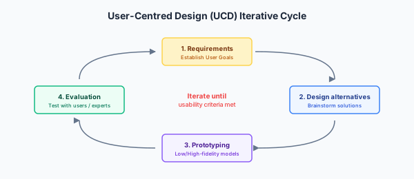
      User-Centred Design (UCD) Cycle: Iterative loop showing Requirements Analysis → User Research → Prototyping → Evaluation cycles.

      The Six Categories of Requirements

      Interaction design requirements are broader than software engineering’s familiar functional/non-functional split. The course uses a six-category framework:

      CategoryDescriptionExample (taxi booking app)
      FunctionalWhat the system does — features and functionsRequest a ride; view driver location in real time; pay in-app; rate driver; schedule advance bookings
      DataWhat data is needed, generated, stored, or transmitted, and in what formatPickup/drop-off GPS coordinates; payment card token; trip history; driver availability data
      EnvironmentalThe physical, social, and technical context of useUsed outdoors, often one-handed while carrying bags; variable network coverage in rural areas; used in daylight and darkness (screen contrast); social context: may be used in a group
      User CharacteristicsSkill level, frequency of use, physical/cognitive constraints, accessibility needs, age rangeWide age range including tourists unfamiliar with the city; occasional users (low frequency → favour Recognition over Recall); some users with visual or motor impairments
      Usability GoalsEffectiveness, Efficiency, Safety, Utility, Learnability, Memorability (Nielsen/Preece framework)Efficiency (fast booking under time pressure); Safety (accurate location, no incorrect fare); Learnability (first-time tourist use)
      UX GoalsThe subjective, emotional, and experiential qualitiesFeeling of trust and control; low anxiety while waiting for pickup; satisfying to use

      Worked Example: Requirements for Two Contrasting Systems

      Air Traffic Control Scheduling System

      CategoryDetail
      FunctionalDisplay real-time aircraft positions; propose take-off/landing sequencing; allow manual override; log all decisions for audit
      DataRadar/transponder feeds, runway status, weather data, flight plans — all with extremely high accuracy and low-latency requirements
      EnvironmentalHigh-stress control-room environment; shared display among multiple controllers (collaboration); 24/7 operation; must remain usable under emergency conditions
      User CharacteristicsHighly trained expert users (frequent, expert use → favour Recall-based shortcuts and dense information display over novice-friendly wizards)
      Usability GoalsSafety is paramount (errors can be fatal); Effectiveness; Efficiency under time pressure — this is a first-wave HCI, task-based, efficiency-driven design problem
      UX GoalsLargely secondary to safety and efficiency here — illustrating that not all systems weight the six categories equally

      The contrast between a taxi app and an ATC system is instructive: the same six categories apply, but the weighting and specific contents differ radically. A good exam answer shows awareness of which categories matter most for this system and justifies the weighting.

      Why the Six-Category Framework Matters

      In exam scenarios, you will often be given a brief description of a system (a mindfulness app for students, a COVID-19 contact-tracing app, a career-guidance platform) and asked to “suggest key requirements.” The six-category framework gives you a systematic approach:

      • Functional requirements describe what the system does.
      • The five non-functional categories describe constraints and context — and often dictate the architecture and design more severely than the functional requirements do.

      A requirement must be testable and falsifiable — phrased as a statement the team can point to and say “this is satisfied” or “this is not satisfied.” Vague adjectives (“user-friendly,” “fast,” “intuitive”) do not qualify.

      Expected Learning

      • Name the six categories of requirements and give a specific, testable example of each for any given system scenario.
      • Explain why the same six categories weight differently for contrasting systems (e.g. a consumer app vs a safety-critical control system).
      • Distinguish usability goals (objective, measurable: learnability, efficiency) from UX goals (subjective, experiential: satisfying, enjoyable, motivating).
      • Phrase requirements as testable, falsifiable statements rather than vague adjectives.

      Past Paper Questions

      Stakeholder analysis and requirements appear in every single Tripos sitting without exception. The worked Example Sheet 1 (Supervision 1, Question 1) directly asks for the six categories applied to a taxi app and an air traffic control system — the model answer is in the Examinable Material section. Past Tripos questions include: 2025 Q5 (career-guidance app — sketch screens + requirements), 2024 Q5 (ChatGPT — stakeholder interview questions), 2023 Q6 (mindfulness app — stakeholders, requirements, design principle), 2022 Q6 (COVID-19 app — data-gathering, stakeholders, requirements, design principle).
    • Stakeholder Analysis with CUSTOM

      Users vs Stakeholders

      A very common Tripos trap (flagged explicitly in supervision material) is treating “stakeholders” as synonymous with “users.” In a hospital system, doctors may be the users — but hospital managers, patients, IT support staff, and regulatory bodies are also stakeholders whose needs and constraints matter. The relationship is: all users are stakeholders, but not all stakeholders are users.

      CUSTOM: Four Kinds of Stakeholder

      The CUSTOM framework identifies four categories:

      TypeWho they areExample (hospital records system)
      Primary stakeholdersDirect, frequent users of the system — the people who actually operate the interface day to dayDoctors and nurses entering and reading patient data
      Secondary stakeholdersOccasional users, or those who interact with the system via an intermediary (e.g. a patient seeing their results through a portal, or a manager who only logs in monthly for reports)Patients viewing their own records through a portal; a ward manager generating monthly statistics
      Tertiary stakeholdersPeople affected by the system but who never interact with it directly — the system’s outputs or consequences affect them without them ever touching the interfacePatients whose treatment depends on the data but who never see the screen; the hospital’s legal and compliance department; the public whose health outcomes depend on the system’s accuracy
      Facilitating stakeholdersThose involved in designing, developing, deploying, or maintaining the system — they do not generally use it for its intended purpose, but their work enables itThe UX design team; the software engineers who build and maintain it; IT support who troubleshoot it; trainers who teach staff to use it

      Why CUSTOM Matters for Design

      Each stakeholder type has different needs, and those needs can conflict:

      • Primary stakeholders (doctors) want efficiency: minimal clicks, dense information, fast data entry.
      • Tertiary stakeholders (patients) want accuracy and privacy of their data, even if it slows the interface down.
      • Facilitating stakeholders (IT support) want robust logging, clear error messages, and simple deployment — features invisible to the primary user.

      A design that optimises for the primary stakeholder alone may fail because it ignores the tertiary stakeholder whose legal rights are violated by insufficient data protection, or the facilitating stakeholder whose maintenance burden is unsustainable. The CUSTOM analysis forces the team to consider all these perspectives at the requirements stage, when re-design is still cheap.

      The “Users ≠ Stakeholders” Exam Trap

      In any Tripos question involving stakeholder analysis, the mark scheme expects you to demonstrate that you understand the difference. Specifically:

      Always name at least one stakeholder who is not a direct user.

      For example, in a question about a university course-feedback system:

      • Primary stakeholders: students filling out the feedback forms.
      • Secondary: lecturers reading the aggregated feedback.
      • Tertiary: the university administration making curriculum decisions based on the data; future students whose course choices are informed by the published results.
      • Facilitating: the IT team maintaining the feedback platform.

      If you only list students and lecturers, you have missed the distinction between stakeholders and users. Add at least one tertiary or facilitating stakeholder to demonstrate the breadth of analysis.

      Expected Learning

      • Define the four CUSTOM stakeholder categories and give a specific example of each for any given system scenario.
      • Explain why “users ≠ stakeholders” and name at least one stakeholder who is not a direct user in a given scenario.
      • Describe how conflicting stakeholder needs can drive design trade-offs, with a concrete example.
      • Apply CUSTOM analysis as the opening framework for any “design a system” exam question.

      Past Paper Questions

      Stakeholder analysis appears in every Tripos sitting. 2024 Q5 asks about stakeholder groups for ChatGPT; 2022 Q6 asks about stakeholders for a COVID-19 contact-tracing app; 2020 Q6 asks about stakeholders for a weather app; 2018 Q6 asks about CUSTOM stakeholders for an order-search system. The Supervision 1 answer for the taxi/ATC question models the full CUSTOM breakdown.

    • Personas and Requirements Pitfalls

      Personas

      A persona is a fictional but realistic profile representing a class of users, built from user research data — not guesswork. A well-constructed persona typically includes:

      • A name and a representative photo or sketch.
      • Goals — what they are trying to achieve.
      • Frustrations — what currently gets in their way.
      • Technical proficiency and domain expertise.
      • A representative quote that captures their attitude.
      • Relevant demographic or contextual details (age, role, environment).

      Why Personas Matter

      1. Focus: they keep the design team concentrated on real user needs rather than an imagined “average user” or — worse — the designer themselves as the implicit model.
      2. Conflict resolution: when the team disagrees about a design decision, the question becomes “would this persona actually do this?” rather than a battle of personal preferences.
      3. Communication: they convey user research findings concisely to stakeholders who were not present during the research.

      Exam Trap: Generic Personas

      “John, 25, likes technology” is not a persona — it is a demographic blob.

      A good persona is specific to the app’s domain and includes a concrete pain point that the design addresses. For a career-guidance app, “Emma, 22, a final-year languages student who feels overwhelmed by the number of career options and does not know where to start — she wants structured, step-by-step guidance, not a search engine” is a useful persona. “Student, 22, wants a job” is not.

      Three Common Pitfalls in Requirements Gathering

      1. Users Cannot Always Articulate Their Own Needs

      Especially for tacit, habitual, or automatic behaviour — a user may genuinely not know why they do something a certain way, because they have never thought about it consciously. Asking “what do you need?” is insufficient.

      Solution: use observational methods (ethnography, contextual inquiry) rather than relying solely on self-report through interviews or questionnaires. Watch what users do, not just what they say.

      2. Stated Preferences Diverge from Actual Behaviour

      A classic pattern: someone claims in an interview that they never use a particular feature, but behavioural log data shows they use it daily. Or they claim to find a feature confusing but complete tasks using it efficiently and without error.

      Solution: triangulate self-report with behavioural or log data. Never accept stated preference as the sole source of truth; corroborate it with observation or analytics.

      3. Requirements Change Over the Project Lifecycle

      As understanding deepens — particularly as prototypes are tested with real users — earlier requirements are found to be wrong, incomplete, or based on faulty assumptions. This is normal and expected; it is not a sign of failure.

      Solution: adopt an iterative UCD process so requirements can be revisited at each cycle, rather than being frozen upfront (waterfall-style). The whole point of prototyping and evaluation is to discover that requirements need changing before those changes become expensive.

      Weak Evidence Does Not Support Strong Claims

      A recurring Tripos question type gives a small piece of evidence and a bold claim, and asks you to critique it. The standard checks:

      CheckExample of a violation
      Sample size”2 of 4 people preferred not to use ring-back” → claimed “half of users don’t use ring-back.” A sample of n=4n=4 is far too small to generalise to “users” as a population.
      Self-report vs observation”Joan said she walked 10 minutes once to collect a printout” → claimed “significant time is wasted by designers generally.” A single anecdote about one person on one day cannot support a claim about a group.
      Maths and source credibility”8 of 1000 logged hours were spent on helpfiles” → claimed ”< 1% of time.” Here 8/1000=0.8%8/1000 = 0.8\%, so the maths checks out and the data source is objective log data across a large sample — this one is well-supported.

      When asked to critique evidence, explicitly check all three: sample size, whether behaviour was observed or self-reported, and whether the quantitative claim follows from the data.

      Good Requirements Checklist

      • Testable: could you write a test that passes or fails based on this requirement?
      • Specific: does it name a concrete capability or constraint, not a vague adjective?
      • Grounded: is it tied to a user need or stakeholder analysis, not invented by the designer?
      • Prioritised: in a list of requirements, which are essential (Must have) and which are desirable (Should/Could have)?

      Expected Learning

      • Describe what a persona is, what it contains, and how it is used in the design process.
      • Critique a given persona for being too generic or insufficiently domain-specific.
      • Name and explain the three common pitfalls in requirements gathering, with solutions for each.
      • Critique a given piece of evidence and claim using the three standard checks (sample size, self-report vs observation, quantitative accuracy).
      • Understand that requirements are iterative and provisional in UCD — they are refined through each cycle.

      Past Paper Questions

      Evidence-critique questions appear in: 2023 Q6 (mindfulness app — evaluating interview findings), 2020 Q5 (evaluating quantitative findings). Personas appear in 2024 Q5 (ChatGPT — suggested personas in a sketch). The “weak evidence → strong claim” trap is tested in the Supervision 1 material.

  • User Research Methods

    Data-gathering methods (interviews, questionnaires, observation, focus groups, ethnography, card sorting, diary studies, contextual inquiry), matching methods to the project stage and to vulnerable or constrained populations, and analysing qualitative data through categorical coding, grounded theory, thematic analysis, and affinity diagramming

    • Data-Gathering Methods Overview

      The User Research Toolbox

      User research is the second phase of the UCD cycle: after defining requirements, you investigate how real users behave, think, and work. The method you choose depends on the project stage, the research question, and the practical constraints of time, budget, and access to users.

      MethodWhat it isWhen to use / pros and cons
      Interviews (structured, semi-structured, unstructured)Direct one-on-one conversation probing attitudes, experiences, and needsPros: rich qualitative data; good for unknown territory; can probe and follow up. Cons: time-intensive; small sample; interviewer bias (the interviewer’s phrasing or presence influences responses).
      Questionnaires / SurveysWritten questions distributed to many participants, typically with Likert scales, multiple choice, and short open-text itemsPros: large sample; quantifiable; quick to distribute; low per-participant cost. Cons: low depth; cannot probe or clarify; low response rates; participants may misinterpret questions with no one to ask.
      Observation (naturalistic or lab-based)Watching users in their real environment or a controlled laboratory settingPros: reveals actual behaviour, not stated behaviour — people often say they do one thing but do another. Cons: intrusive (observer may change behaviour — the Hawthorne effect); time-consuming; lab-based observation has low ecological validity.
      Focus GroupsModerated group discussion with 5–10 participants debating a topic or reacting to a designPros: debate reveals a range of views and consensus; efficient for multiple perspectives at once. Cons: groupthink (participants converge on a dominant opinion); dominant voices can silence minority views.
      EthnographyLong-term embedded observation in the user’s natural context — the researcher is a participant-observerPros: deep, holistic understanding of “what happens” and “how it matters”; surfaces tacit, invisible workarounds. Cons: very time-consuming (weeks or months); expensive; hard to generalise from one site.
      Card SortingParticipants sort physical or digital cards (each labelled with a piece of content or a function) into groups that make sense to themPros: reveals users’ natural mental models for organising information; directly informs Information Architecture. Cons: subjective; needs many participants for reliable similarity data; does not test whether the resulting IA is actually usable.
      Diary StudiesParticipants self-record experiences over a period of days or weeks using structured logs, voice notes, or a diary appPros: captures longitudinal, in-the-moment behaviour; reveals patterns over time. Cons: heavy reliance on participant compliance — many participants drop out or record inconsistently.
      Contextual InquiryA hybrid of interview and observation, conducted in situ while the user performs their real tasksPros: deeply contextual; reveals tacit knowledge; the user can demonstrate and explain simultaneously. Cons: labour-intensive; requires access to the real environment; may disrupt the user’s work.

      The Fundamental Distinction: Stated vs Actual Behaviour

      Every self-report method (interviews, questionnaires, focus groups) captures what users say they do or think. Observational methods (ethnography, contextual inquiry, lab-based observation) capture what users actually do. These often diverge significantly — and the gap between them is where many usability problems hide.

      A user may genuinely believe they “always check the error message before dismissing it,” but observation reveals they dismiss it reflexively within 200 ms without reading it. The self-report is sincere but inaccurate; the observational data is what the design must address.

      When to Use Each Method

      The choice of method depends primarily on the project stage within the UCD cycle:

      UCD StageAppropriate Methods
      Early / formative (discovery)Ethnography, contextual inquiry, unstructured interviews — open-ended research questions, no working system needed
      Mid-stage (defining information architecture and structure)Card sorting, focus groups, semi-structured interviews
      Pre-launch (validating a design before release)Lab-based observation, cognitive walkthrough, semi-structured interviews with a prototype
      Post-launch (summative, measuring success)Questionnaires at scale, A/B testing, analytics and log data

      Matching the method to the stage is itself an examinable skill. Using a questionnaire in the early discovery stage — when you do not yet know what to ask about — is a common design-process error. Using ethnography post-launch to measure satisfaction is wasteful when a questionnaire would achieve the same at a fraction of the cost.

      Expected Learning

      • Name at least six data-gathering methods and describe what each captures.
      • Distinguish self-report methods from observational methods, and explain why the divergence matters.
      • For a given project description and UCD stage, recommend an appropriate method and justify the choice.
      • Explain why method choice depends on project stage, and identify inappropriate matches (e.g. questionnaires in early discovery).

      Past Paper Questions

      Method selection appears in: 2023 Q6 (mindfulness app — user research methods), 2022 Q6 (COVID-19 app — data-gathering methods), 2020 Q6 (weather app — data collection for visually impaired users), 2019 Q6 (primary stakeholder data-gathering techniques). The Supervision 1 Question 2 directly asks about suitable and unsuitable projects for each of the six core methods.

    • Matching Methods to Project and Population

      Suitable vs Unsuitable Projects for Each Method

      A standard Supervision and Tripos question type asks you to explain when a method is suitable and when it is unsuitable — not just to define the method generically, but to apply it to a specific project context.

      Worked Examples: The Six Core Methods

      Questionnaires

      • Suitable for: a large-scale redesign of a university course-feedback system — you need quantifiable, comparable data across hundreds of students, and the research questions are well-defined from prior qualitative work. The questionnaire can be deployed at scale at the summative stage.
      • Unsuitable for: early exploratory design of a brand-new mental-health support app, where you do not yet know what to ask about — the questions themselves would bias the research toward what the designer already thinks is important, missing completely unexpected user needs that interviews or ethnography would surface.

      Interviews

      • Suitable for: understanding why senior citizens distrust a new banking app — rich, probing, semi-structured conversations let you follow unexpected threads and surface emotional barriers that a questionnaire’s fixed categories would miss. Used at the formative stage.
      • Unsuitable for: a high-frequency A/B test of button colour on a checkout page — far too slow and small-sample for a statistical comparison; a questionnaire or click-through log would be faster, cheaper, and yield actionable quantitative data.

      Ethnography

      • Suitable for: redesigning hospital ward communication systems — a classic second-wave HCI, socio-technical problem where shift handovers involve physical artefacts (whiteboards, sticky notes, verbal reports) and the deep contextual understanding fieldwork provides is essential.
      • Unsuitable for: optimising the KLM timing of a keyboard shortcut — that needs controlled, quantitative measurement (Fitts’ Law modelling, lab timing), not weeks of contextual immersion.

      Lab-based observation

      • Suitable for: comparing completion time and error rate of two checkout flows under controlled conditions — removing environmental noise lets you isolate the interface as the independent variable, enabling a t-test or sign test.
      • Unsuitable for: understanding how a smart-home device is actually used amid family life — the lab strips away the very context (children interrupting, different family members using the device at different times, ambient noise) that determines real-world usability. This is a low-ecological-validity mismatch.

      Focus groups

      • Suitable for: gauging early reactions and points of disagreement about a proposed feature among diverse stakeholder groups — e.g. teachers reacting to a new classroom app, where the debate itself reveals the range of concerns.
      • Unsuitable for: sensitive personal topics (financial hardship, mental health, domestic abuse) where social pressure would suppress honest answers and the group setting would actively harm the quality and ethics of the research.

      Card sorting

      • Suitable for: designing the navigation menu of a large e-commerce site — reveals how users naturally categorise thousands of products into a browsable hierarchy (Information Architecture).
      • Unsuitable for: evaluating a highly sequential, task-based system like an ATM withdrawal — the interaction is a fixed sequence, not a browsable hierarchy. Card sorting provides no insight into sequential task flow; a cognitive walkthrough or KLM analysis would be appropriate there.

      Adapting Methods for Vulnerable or Constrained Populations

      Some user groups present specific challenges that rule out certain methods:

      Visually Impaired Users

      For a colour-to-sound wearable device (2020 Tripos): visual questionnaires, Likert scales, and physical card sorting are problematic or impossible unless heavily adapted. Observing facial expression for engagement or frustration is not meaningful if the user cannot see and does not produce the expected expressions. Better fit: interviews, verbal think-aloud protocols, contextual inquiry, diary studies using voice recordings.

      Users Under Emotional Strain

      For a mindfulness app targeting anxious students (2023 Tripos): long, clinical-feeling interviews and direct observation during a panic or anxiety episode can be intrusive, stressful, or even harmful. Better fit: lightweight diary studies where the user records in their own time; validated psychometric questionnaires (standardised stress/anxiety scales); short, gentle semi-structured interviews in a comfortable setting.

      Time-Pressured Expert Users

      For air-traffic controllers, financial traders, or emergency dispatchers: long interviews disrupt their work and are unsafe during operations. Better fit: contextual inquiry in short bursts between shifts; structured logging/analytics of actual performance; brief post-hoc debriefs after discrete tasks.

      The General Principle

      When a standard method is unsuitable for a specific population, the exam answer should: (1) name the method that would normally be used, (2) explain specifically why it is unsuitable for this population — citing a concrete barrier (visual, cognitive, emotional, time-pressure), and (3) propose a modified or alternative method that addresses that barrier.

      Expected Learning

      • For each of the six core methods, give a concrete project for which it is suitable and one for which it is unsuitable, with specific justifications.
      • Explain why ecological validity matters when choosing between lab and field methods.
      • For a given user population with specific constraints (visual impairment, emotional vulnerability, time pressure), identify which methods are unsuitable and which alternatives are appropriate.
      • Always use the three-step pattern: name the standard method → explain why it fails for this population → propose a concrete alternative.

      Past Paper Questions

      Method suitability is tested in: 2023 Q6 (mindfulness app — methods for emotionally vulnerable users), 2020 Q6 (weather app — data collection for visually impaired users), 2022 Q6 (COVID-19 app — methods under pandemic constraints). The Supervision 1 Question 2 directly tests suitable vs unsuitable projects for all six methods.

    • Analysing Qualitative Data

      Once data has been gathered — interview transcripts, observation notes, diary entries, open-ended questionnaire responses — it must be systematically analysed to extract findings that can inform design. Raw data is not evidence; analysed data is.

      Categorical Coding (for Closed Questions)

      When the research questions are defined in advance and the data fits into pre-existing categories:

      1. Build a coding frame of expected categories before looking at the data. The categories should be mutually exclusive (no overlap) and collectively exhaustive (every data point fits somewhere).
      2. Segment the text — break transcripts into analysable units (a phrase, a sentence, a short paragraph expressing one idea).
      3. Assign each segment to one category.
      4. Compare frequency and co-occurrence of categories across groups (e.g. do novice users mention “confusion” more often than experts?).

      Inter-rater reliability must be measured and reported: have at least two independent coders code the same data, then compute agreement. Cohen’s κ\kappa for two coders; Fleiss’ κ\kappa for more than two. κ[0.6,0.8]\kappa \in [0.6, 0.8] is typically considered “substantial agreement”; below 0.4 is “poor.” Reporting κ\kappa protects against the criticism that the coding frame is merely the researcher’s subjective interpretation.

      Grounded Theory (for Open Questions, No Prior Hypothesis)

      Grounded theory is used when you do not know in advance what categories will emerge — the theory is built from the ground up from the data:

      1. Open coding: read the data closely line by line, tagging every potentially interesting concept without a predetermined frame.
      2. Write memos capturing insights, connections, and emerging patterns as you code.
      3. Axial coding: organise the open codes into broader themes, identifying relationships between categories.
      4. Constant comparison: continuously compare new data against the emerging themes and memos — do the themes still hold? Do they need revising?
      5. Stop at theoretical saturation: when new data no longer changes the themes or generates new insights, the theory is stable. Continuing to collect data beyond saturation wastes resources without improving understanding.

      Thematic Analysis

      A lighter-weight relative of grounded theory. Instead of building a full theory, the researcher identifies recurring patterns (themes) across a dataset. Thematic analysis is more descriptive and less theoretically ambitious than grounded theory, but it is faster and more practical for many applied design-research contexts.

      Affinity Diagramming

      A practical, collaborative technique used in design workshops rather than formal research. Individual findings (observations, quotes, pain points) are written on sticky notes. The design team physically groups related notes on a wall or whiteboard, creating clusters that reveal emergent themes. Unlike grounded theory, affinity diagramming is fast, collaborative, and can be done in a single afternoon — but it lacks the rigour, inter-rater reliability, and saturation criterion of formal qualitative analysis.

      Validity and Reliability in Qualitative Research

      ConceptHow to improve it
      Validity (are you measuring what you claim to measure?)Triangulation: use multiple methods or data sources (e.g. interview + observation + questionnaire) to cross-check findings. Member-checking: show your findings back to participants and ask “does this reflect your experience?”
      Reliability (would another researcher get the same results?)Use multiple independent coders and report inter-rater agreement (κ\kappa). Document your coding process so it is auditable.

      Bad Evaluation Techniques — Never Do This

      Some common but indefensible practices to recognise and avoid:

      Leading Questions

      “Do you like this nice new interface more than that ugly old one?”

      Looks quantitative (a 1–10 rating) but is biased by experimental demand — the participant feels pressure to agree with the researcher, especially if they are a friend or colleague. The wording embeds the desired answer.

      Unevidenced Assertions

      “It was deemed that more colours should be used to increase usability.”

      Phrased to sound like a research finding, but is pure opinion — no evidence, no method, no participants. The passive voice (“it was deemed”) hides the absence of any actual evaluation.

      The HiPPO Method

      “I find it more intuitive this way, and the users will too.”

      HiPPO = Highest-Paid Person’s Opinion. Common in industry, where a senior stakeholder’s personal preference overrides research evidence. The designer (or CEO, or product manager) is not a representative user — their technical knowledge, domain expertise, and familiarity with the design make them the worst possible judge of its usability for actual users. Never present HiPPO as evidence in an exam answer or in professional practice.

      Expected Learning

      • Describe the four steps of categorical coding and explain why inter-rater reliability (κ\kappa) must be reported.
      • Contrast grounded theory with thematic analysis and affinity diagramming in terms of rigour, time, and appropriate use contexts.
      • Define triangulation and member-checking, and explain how each improves validity.
      • Identify and critique bad evaluation techniques (leading questions, unevidenced assertions, HiPPO) in a given scenario.
      • Explain theoretical saturation and why it matters for grounded theory.

      Past Paper Questions

      Qualitative data analysis is discussed in: 2024 Q5 (ChatGPT — interview-data analysis), 2023 Q6 (mindfulness app — interpreting qualitative user research). The supervision material directly covers coding and analysis methods.

  • Task Analysis

    Hierarchical Task Analysis (HTA) — decomposing tasks into sub-tasks and actions with plans; worked examples; and the limitations of task analysis (fixed sequences, ignoring cognitive state, poor error modelling)

    • Hierarchical Task Analysis (HTA)

      What Is Task Analysis?

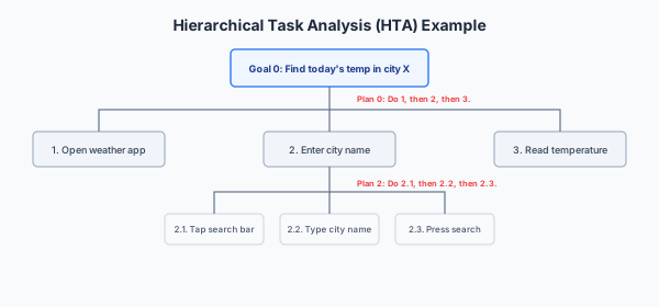
      Task analysis decomposes a task into a sequence of sub-tasks and actions to understand how users achieve their goals. It models what the user does, not what the system does. The most common form in interaction design is Hierarchical Task Analysis (HTA): a tree of goals, sub-goals, and operations, with plans specifying the order in which sub-goals should be carried out.

      A plan can specify:

      • Sequence: do 1, then 2, then 3.
      • Selection: if condition X, do 1; otherwise do 2.
      • Iteration: repeat 1 until condition Y.
      • Parallelism: do 1 and 2 simultaneously.
      HTA tree: goal 'Find today's temperature in city X' decomposes into Open Weather App → Enter city name → Read temperature, with further sub-decomposition at each level.

      Worked Example: HTA for “Find Today’s Temperature in City X”

      For a weather app that is not yet open (2020 Tripos style):

      0. Find today's temperature in city X
        1. Open Weather App
           1.1 Locate app icon on home screen
           1.2 Tap to launch
        2. Enter city name
           2.1 Tap search/city field
           2.2 Type city name ("Cambridge")
           2.3 Submit search (tap search key or "Go")
        3. Read temperature from display
      
      Plan 0: do 1, then 2, then 3.
      Plan 2: do 2.1, then 2.2, then 2.3.

      The numbering convention is important: sub-goals are numbered hierarchically (1, 2, 3 are children of 0; 1.1, 1.2 are children of 1). The plan attached to each non-leaf goal specifies the execution order.

      Why Task Analysis Matters for Interaction Design

      • It forces systematic thinking about what the user actually does, rather than what the designer assumes they do. Steps the designer considers trivial (locating the app icon) may be a genuine bottleneck for the user.
      • It provides the action sequence for a Cognitive Walkthrough — the CW walks through a task analysis step by step, asking the four questions at each stage.
      • It supports KLM/GOMS modelling — the task decomposition is the input to the timing model.
      • It identifies opportunities for design improvement: if the task analysis shows 12 steps to achieve a common goal, the design may need simplification. If users consistently take a different path than the plan specifies, the interface may be signalling the wrong sequence.

      Limitations of Task Analysis

      Task analysis is a powerful tool, but it has significant limitations. When asked whether a limitation applies to a specific system, explicitly connect it: “this limitation applies because…”

      LimitationExplanation
      Assumes a fixed sequenceIgnores opportunistic, exploratory, or non-linear behaviour. Users do not always follow a plan — they explore, backtrack, and improvise. HTA is poor at modelling creative or open-ended work.
      Ignores cognitive and emotional stateDoes not capture cognitive load, frustration, anxiety, or motivation — all of which affect real-world performance. Two users following the same HTA may have radically different experiences.
      Struggles with high variabilityDifficult to apply where tasks are highly context-dependent or where there is no single “correct” path (e.g. creative collaboration, open-ended data exploration).
      Misses tacit knowledgeExpert shortcuts and automatic behaviours that experts perform without conscious thought are easy to omit from the model — the expert does not even know they are doing them.
      Poor at modelling errorsDoes not naturally represent error states or recovery paths, which is where many real usability problems occur. A user who takes a wrong turn at step 2.2 has no modelled path back.
      Cannot model novel or first-time tasksTask analysis requires knowing the task in advance. For genuinely novel interaction (exploring a new device for the first time), there is no pre-existing task to analyse.

      Expected Learning

      • Define HTA and describe its components: goals, sub-goals, operations, and plans.
      • Decompose a described task into an HTA with at least three levels, writing numbered sub-goals and a plan at each non-leaf level.
      • Explain how HTA supports Cognitive Walkthrough and KLM/GOMS.
      • Name at least four limitations of task analysis, and for each, explain the specific circumstance in which it becomes a problem.
      • For a given system, state whether task analysis is appropriate and justify with reference to the system’s characteristics (fixed-sequence vs exploratory, expert vs novel).

      Past Paper Questions

      Task analysis appears in: 2020 Q5 (task-analysis limitations; evaluating quantitative findings), 2017 Q5 (task model for GestureDriver interface; generic problem task analysis can identify). HTA is the foundation for Cognitive Walkthrough questions in 2021, 2022, and 2025.

  • Prototyping

    The fidelity spectrum (Lo-Fi vs Hi-Fi prototypes, when each is appropriate), named prototyping methods (paper prototyping, Wizard of Oz, wireframing, vertical and horizontal prototypes, interactive mockups), and exam technique for sketching designs

    • The Fidelity Spectrum: Lo-Fi vs Hi-Fi Prototyping

      What Is a Prototype?

      A prototype is a preliminary representation of a design used to explore ideas and test them with users before committing to full implementation. Two defining characteristics:

      1. They exist on a fidelity spectrum, from rough paper sketches to fully interactive digital mockups.
      2. They are disposable — they exist to learn from, not to become the shipped product. The cost of throwing away a prototype is the cost of the learning it enabled, not the cost of rework.

      Low-Fidelity (Lo-Fi) Prototypes

      Lo-Fi prototypes use inexpensive, non-technical materials: paper, card, sticky notes, whiteboard sketches. They are rough, clearly incomplete, and obviously not the final product.

      Key characteristics:

      • Quick and cheap to create, modify, and discard — you can iterate several designs in a single afternoon.
      • Test overall structure, navigation, and concept — not visual detail, colour, or precise layout.
      • Encourage open, unintimidated feedback: users criticise a rough sketch far more freely than a polished screen because they do not feel they are criticising “finished” work that someone spent weeks building.
      • Can be created and changed within a single design session, enabling rapid co-design with users present.

      When to use Lo-Fi:

      • Early in the UCD cycle, when the design direction is still unsettled.
      • When exploring multiple alternative concepts and you need quick comparative feedback.
      • When you want users to focus on structure and flow, not visual polish.

      High-Fidelity (Hi-Fi) Prototypes

      Hi-Fi prototypes are interactive digital mockups that closely resemble the final product in look-and-feel. They may use real UI components, actual colour schemes, and realistic data.

      Key characteristics:

      • Close to the final look-and-feel — suitable for detailed usability testing and stakeholder sign-off.
      • Needed to test things that only work at high fidelity: precise timing effects (Fitts’ / Hick’s Law effects); aesthetic judgement; realistic Cognitive Walkthroughs where visual hierarchy and salience matter.
      • More expensive and slower to change — so they are used later in the UCD cycle, once the structural design has been validated through Lo-Fi testing.

      When to use Hi-Fi:

      • Late in the UCD cycle, when the structure is settled and you are refining details.
      • For summative evaluation — measuring whether the final design meets predefined usability targets.
      • When presenting to stakeholders who need a realistic preview before signing off on development.

      Why Lo-Fi Encourages Better Feedback

      This is a specific examinable point. Users are more honest with Lo-Fi prototypes because:

      1. The roughness signals “this is a draft — your criticism is wanted and expected.” A polished Hi-Fi prototype signals “this is nearly finished — criticism would be rude or pointless.”
      2. Users focus on structure and flow rather than fixating on surface details. With a Hi-Fi prototype, a user might say “I don’t like the blue — could you make it green?” — a cosmetic opinion that wastes evaluation time. With a Lo-Fi sketch, such comments do not arise because there is no colour to critique.
      3. Lo-Fi’s disposability lowers the designer’s own emotional investment — they are more willing to throw away a sketch that took 10 minutes than an interactive mockup that took two days.

      Expected Learning

      • Distinguish Lo-Fi from Hi-Fi prototypes in terms of cost, speed, appropriate UCD stage, and the type of feedback each elicits.
      • Explain why Lo-Fi prototypes encourage more honest and structural feedback, with reference to user psychology.
      • For a given design scenario, recommend Lo-Fi or Hi-Fi and justify the choice.
      • Understand that prototyping is iterative — Lo-Fi validates structure; Hi-Fi validates detail; both feed back into the UCD cycle.

      Past Paper Questions

      Prototyping appears in: 2025 Q5 (sketch app screens — Lo-Fi), 2023 Q6 (mindfulness app — prototyping methods), 2021 Q5 (Lo-Fi prototype alternatives), 2018 Q6 (CUSTOM stakeholders; Lo-Fi/Wizard of Oz prototyping). The exam frequently asks you to justify why Lo-Fi is appropriate for a specific scenario.

    • Named Prototyping Methods

      The Prototyping Toolkit

      Beyond the Lo-Fi/Hi-Fi distinction, the course covers several named prototyping methods. Each serves a different purpose and is appropriate at a different stage.

      MethodDescriptionBest for
      Paper prototypingHand-drawn screens on paper or card. A human facilitator plays the role of the “computer,” swapping screens in response to user actions.Earliest-stage concept testing. Fastest and cheapest method. Tests overall structure and navigation.
      Wizard of OzA human secretly operates the “system” behind the scenes while the participant believes they are interacting with a real (often automated or AI) system. The participant’s actions are intercepted and the human generates plausible responses.Testing interaction concepts before the underlying technology exists — e.g. testing a speech interface before the speech-recognition engine is built, or testing an AI recommendation system before the ML model is trained.
      WireframingLow-detail digital layouts showing structural layout — where text, buttons, images, and navigation go — without colour, imagery, or precise typography.Mid-stage structural validation. More shareable and consistent than paper sketches; still clearly not “finished.”
      Hi-Fi digital mockupHigh-detail static screens showing final look-and-feel (colour, typography, imagery, branding) but not necessarily interactive.Stakeholder sign-off on visual design; detailed aesthetic evaluation.
      Interactive prototypeClickable prototype linking mockup screens to simulate navigation without real back-end logic. Tools like Figma, Adobe XD, or Sketch.Usability testing of navigation flows; testing whether the user understands where to tap and what happens next.
      Vertical prototypeFull, deep implementation of a small number of features — all layers (UI, business logic, database) are functional for those features.Testing technical feasibility and depth. “Can we actually build the recommendation engine that powers this one feature?”
      Horizontal prototypeShallow implementation across all features — the UI for every screen exists, but the back-end logic is mocked or missing.Testing breadth and overall user-journey coverage. “Does the flow from login through checkout make sense as a complete experience?”

      Wizard of Oz in Detail

      Wizard of Oz prototyping deserves special attention because it is conceptually unusual and highly examinable (2018 Q6, 2021 Q5).

      The user interacts with what they believe to be a functional system. Unknown to them, a human “wizard” is observing their actions and generating the system’s responses in real time — typing the response text, triggering the next screen, or speaking as the “voice assistant.” The wizard follows a script or protocol to ensure responses are consistent.

      When Wizard of Oz is the right choice:

      • The technology to genuinely implement the system does not yet exist (e.g. testing a gesture-recognition interface before the computer-vision pipeline is built).
      • The cost of building a real prototype for a one-off test is prohibitive.
      • You want to test the interaction concept (does this conversational flow feel natural?) before committing to the implementation concept (which ML model, which NLP pipeline).

      Risks:

      • The wizard may be inconsistent across participants, introducing confounding variables.
      • The wizard’s response time may be slower or faster than the real system, distorting user perception.
      • If the user discovers the deception, trust in the research process is damaged.

      Exam Tip: Sketching a Design

      When asked to sketch an app design in a Tripos answer:

      • Draw 2–4 clearly labelled screens, with captions describing interactive elements (what happens when the user taps each).
      • Explicitly connect each screen back to a requirement you stated earlier in your answer: “the Resume Builder screen satisfies Requirement 2: users must be able to edit their CV offline.”
      • Marks are awarded for labelling and justification, not artistic quality. A rough but clearly annotated sketch scores higher than a beautiful but unexplained drawing.

      Expected Learning

      • Name and distinguish the seven prototyping methods (paper, Wizard of Oz, wireframing, Hi-Fi mockup, interactive prototype, vertical prototype, horizontal prototype).
      • Explain what Wizard of Oz prototyping is, when it is appropriate, and what its risks are.
      • For a given scenario, recommend an appropriate prototyping method and justify the choice with reference to the UCD stage, the research question, and practical constraints.
      • Understand exam sketching expectations: labelled screens, captions, and explicit links to requirements.

      Past Paper Questions

      Wizard of Oz appears in 2018 Q6 and 2021 Q5. Prototyping method selection appears in 2023 Q6 (mindfulness app). Sketching designs appears in 2025 Q5 (career-guidance app — sketch screens), 2024 Q5 (ChatGPT — sketch design screens), and 2021 Q5 (timepiece — Lo-Fi alternatives).

  • Cognitive Foundations

    Human memory (working/LTM, Miller's 7±2, recognition vs recall), human attention (selective, divided, sustained, pre-attentive), design implications of both, and Gestalt theory (Proximity, Similarity, Continuity, Closure, Figure/Ground, Common Fate) with the three-step exam method: name → locate → explain effect

    • Human Memory and Design

      Why Memory Matters for Interaction Design

      Users do not arrive at an interface as blank slates. They bring prior knowledge, expectations, and cognitive constraints. Memory theory tells us what users can reasonably be expected to hold in mind, recall, and recognise — and therefore what an interface must support rather than demand.

      Memory Types and Their Design Implications

      Memory TypeCapacity and CharacteristicsDesign Implication
      Working / Short-Term Memory (STM)Limited capacity: Miller’s Magic Number, 7±27 \pm 2 items. Information decays rapidly unless actively rehearsed (within seconds).Minimise how many things a user must hold in mind at once. Use chunking — group information into fewer, larger, meaningful units (e.g. a phone number as 01223 338000 rather than 0 1 2 2 3 3 3 8 0 0 0). Never require users to remember a value from one screen to use on the next — carry state forward automatically.
      Long-Term Memory (LTM)Effectively unlimited capacity, but slower, more error-prone retrieval. Stores learned schemas (organised knowledge structures) and mental models (internal representations of how a system works).Good design matches the mental models users already bring from prior experience rather than demanding they learn an entirely new model. A file manager that behaves like a physical filing cabinet is easier to learn because users already have a schema for “folders containing documents.”
      RecognitionSeeing an option and knowing it is correct — a matching task against a visible stimulus. Cognitively cheap.Present options visibly rather than requiring users to generate them from memory. This directly underlies Nielsen Heuristic #6: Recognition Rather Than Recall. A dropdown menu is recognition; a command-line interface is recall.
      RecallGenerating the option purely from memory with no visible cue. Cognitively expensive and error-prone.Avoid whenever possible. When recall is unavoidable (e.g. a password), support it: allow password managers, show hints, offer “forgot password” recovery.

      Design Principles Derived from Memory Constraints

      1. Never require users to remember information from one screen to use it on the next. Carry the context forward. If a user selects a product on Screen 1, Screen 2 should show the selected product’s details — not require the user to remember and re-enter the product name.

      2. Use consistent terminology throughout the interface. If a function is called “Bookmarks” on one screen and “Saved Items” on another, the user must learn two labels for the same concept — doubling the LTM encoding burden. Consistency reduces learning cost.

      3. Progress indicators and breadcrumbs reduce the need to recall “where am I?” — the interface shows the current location within the navigation hierarchy.

      4. Autocomplete and sensible defaults convert a recall task into a recognition task. Typing “Cam” into a city field and seeing “Cambridge” appear as a suggestion is faster and less error-prone than recalling and typing the full name correctly.

      Expected Learning

      • Name Miller’s Magic Number and explain its design implication.
      • Distinguish recognition from recall, and explain why recognition is cheaper.
      • Given an interface design, identify places where unnecessary recall is demanded and suggest how to convert it to recognition.
      • Explain why consistent terminology reduces cognitive load.
      • Describe how chunking helps work within STM limits.

      Past Paper Questions

      Memory appears in: 2025 Q6 (Microsoft Teams — human memory), 2023 Q5 (CamCORS — human memory and IA). The Supervision 2 material covers memory in the context of Heuristic Evaluation (particularly Heuristic #6).

    • Human Attention and Design

      Attention Types

      Human attention is not a single resource — it has multiple modes, each with distinct characteristics and design implications.

      Attention TypeDescriptionDesign Implication
      Selective (Focused) AttentionUsers focus on one thing at a time; everything else fades from awareness. This is why “change blindness” occurs — a user does not notice a change in a part of the screen they are not currently attending to.Important content must be made salient — through contrast, size, weight, colour, or position. The user’s attention must be directed to the critical element; you cannot assume they will notice it just because it is on the screen.
      Divided AttentionPerforming two tasks simultaneously is hard, error-prone, and fatiguing. Task-switching costs (the cognitive overhead of switching contexts) are real and measurable.Avoid designs that force users to monitor multiple UI regions simultaneously. If a task requires comparing two pieces of information, place them adjacent so they can be viewed in a single fixation.
      Sustained Attention (Vigilance)Attention degrades over time — performance on monitoring tasks drops significantly after 20–30 minutes.Break long forms, multi-step processes, and monitoring tasks into shorter chunks. Provide clear progress feedback so users know how much remains.
      Pre-attentive ProcessingCertain visual features (colour, size, shape, motion) are processed before conscious attention engages — within 200 ms, without effort.Use sparingly, for genuinely urgent items only. A single red notification badge is pre-attentively salient. If every element on the screen uses pre-attentive cues — red badges everywhere, multiple animations, competing bold text — the visual hierarchy collapses and nothing is distinguishable.

      Worked Example: Microsoft Teams Notification Badges (2025 Q6)

      A red numbered badge on the Activity icon uses pre-attentive colour and numerosity to draw selective attention to unread items — an effective, deliberate application of attention theory. The badge is processed before the user consciously “reads” the interface; they know there is something to attend to without effort.

      However, if every icon in the interface carries a badge — Activity, Chat, Teams, Calendar, Files — the visual hierarchy collapses. Nothing is pre-attentively distinguishable any more, because the cue that previously signalled urgency (a red badge) is now everywhere, signalling nothing in particular. Pre-attentive cues only work while they remain rare and contrastive.

      Design Principles Derived from Attention Constraints

      1. Use visual hierarchy (size, weight, colour, whitespace) to direct attention to the most important element first. The user should be able to answer “what is the main action on this screen?” in under a second.

      2. Avoid animating non-critical elements. Movement hijacks selective attention automatically — the visual system is hardwired to orient toward motion. If you animate a decorative background while the user is trying to read a form, you are fighting their attention. Reserve animation for genuinely useful feedback.

      3. Reserve pre-attentive cues (red, blinking, bold, motion) for urgent notifications that genuinely require immediate action. If every notification is “urgent,” none are.

      4. The Attention Investment Theory (covered in detail later) models users as rational investors of a scarce resource (attention): they will only invest attention where the expected return justifies the cost. An interface that demands attention without delivering value will be abandoned or worked around.

      Expected Learning

      • Name the four attention types (selective, divided, sustained, pre-attentive) and give a design implication for each.
      • Explain why pre-attentive cues only work when rare, with the Teams notification badge example.
      • Critique a given interface for attention-design failures (visual hierarchy collapse, unnecessary animation, attention competition).
      • Understand that attention is a scarce resource and interfaces compete for it — good design respects this scarcity.

      Past Paper Questions

      Attention appears in: 2025 Q6 (Microsoft Teams — human attention in notifications and multitasking), 2023 Q5 (CamCORS — cognitive load and information architecture). The topic is a 25/26 syllabus differentiator: expect it to remain examinable.

    • Gestalt Theory and Visual Perception

      What Gestalt Theory Describes

      Gestalt theory (from the German for “shape” or “form”) describes how humans perceive visual elements as organised wholes rather than as independent parts — “the whole is more than the sum of its parts.” For interaction design, Gestalt principles explain how layout and grouping choices affect perception — and therefore usability — often before the user consciously reasons about the interface at all.

      The theory’s central insight: the human visual system has innate grouping tendencies. Designers can either work with these tendencies (grouping related items so they are perceived as related) or work against them (placing unrelated items close together and accidentally signalling a relationship that does not exist). Misapplied Gestalt principles actively mislead users.

      The Six Core Gestalt Principles

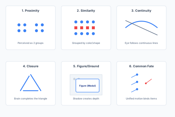
      Gestalt Principles of Visual Grouping: Proximity, Similarity, Continuity, Closure, Figure/Ground, and Common Fate panels illustrating each principle.
      PrincipleDefinitionDesign Application
      ProximityElements placed close together are perceived as belonging to the same group.Group related form fields; keep a label adjacent to its input; cluster related navigation items. Separating unrelated items with whitespace signals they are distinct.
      SimilarityElements that look alike (colour, size, shape, texture) are perceived as related.Use consistent styling for all primary-action buttons; a shared icon style for related functions; a distinct colour for destructive actions (delete, cancel).
      Continuity (Good Continuation)The eye follows smooth, continuous paths; elements arranged along a line or curve are perceived as connected.Align elements to a grid; use a visual flow to guide the eye through a multi-step form; a progress indicator that follows a linear path.
      ClosurePeople perceive incomplete shapes as complete, mentally filling in gaps.A partial ring as a circular progress indicator; card borders implied by whitespace and shadow alone; simplified icon glyphs where the brain fills in missing contours.
      Figure/GroundPerception separates the visual field into a salient figure (the focus of attention) and a receding ground (the background).Modal dialogues that dim the background behind them; card elevation with shadow creating depth; contrast between content and canvas. The figure must be clearly distinguishable from the ground — low-contrast text on a similar-colour background violates this principle.
      Common FateElements that move in the same direction or manner are perceived as a group.Elements that animate or slide in together are perceived as related; parallax scrolling visually binds related content layers.

      The Exam Method: Three Steps for Every Principle

      The examiners consistently reward a fixed three-step pattern. Never name a Gestalt principle without completing all three:

      1. Name the principle explicitly — “Proximity,” not “things are close together.”
      2. Locate where in the given figure or interface the principle operates — point to specific elements.
      3. Explain the effect on the user’s perception or behaviour — “the user perceives these as one group, reducing search time” or “the modal dialogue focuses attention on the alert by pushing the background visually behind it.”

      Worked Example: Superstore Sales Dashboard (2022 Q5a)

      • Proximity: country names are placed directly beside their corresponding sales figures, so the two are perceived as one data point rather than unrelated text and numbers.
      • Similarity: all revenue figures share one colour/weight and all quantity figures share another, letting the eye separate the two data types across the whole dashboard without re-reading column headers.
      • Continuity: the shared, aligned baseline of the bar chart lets the eye read relative bar heights along one continuous reference line, supporting quick visual comparison between countries.

      Gestalt in Tripos History

      Gestalt appears almost every year. The pattern is consistent: the exam presents a figure (a dashboard, a blog interface, a profile layout, a map) and asks you to identify which principles are being applied. Memorise all six with one crisp example each.

      Expected Learning

      • Name all six Gestalt principles with a definition and a concrete design example for each.
      • Apply the three-step exam method (name → locate → explain effect) to any given interface figure.
      • Critique a misapplied Gestalt principle — e.g. items placed far apart that should be grouped, or dissimilar items placed close together that misleadingly suggest a relationship.
      • Explain why Gestalt matters for interaction design: perception precedes cognition, and layout errors that violate Gestalt principles mislead the user before they even start reasoning about the interface.

      Past Paper Questions

      Gestalt appears in: 2024 Q6 (applied to own design), 2022 Q5 (Superstore Sales Dashboard), 2020 Q6 (six principles), 2019 Q6 (four UI elements — blog, Twitter, maps), 2017 Q6 (six principles applied to a given figure). This is one of the most frequently examined topics on the paper.

  • Design Principles and Information Architecture

    Norman's design principles (affordance, signifier, feedback, mapping), the fundamentals of visual representation (typography, maps/graphs, schematics, icons, the desktop metaphor), Cognitive Dimensions of Notations (14 dimensions, notational activities, trade-off analysis), and Information Architecture (organisation, labelling, navigation, and search systems with IA diagrams)

    • Norman's Design Principles and Visual Representation

      Norman’s Four Core Principles

      Don Norman’s principles provide a vocabulary for analysing why an interface element is easy or hard to use:

      PrincipleDefinitionCounter-example (violation)
      AffordanceA property of an object that suggests how it can be used. A button’s raised shape affords pressing; a handle affords pulling.A flat rectangle that looks like a label but is secretly tappable — there is no visual cue that pressing it will do anything.
      SignifierAn explicit visual or perceptual cue that communicates an affordance. A drop-shadow signifying that a flat rectangle is actually a clickable button; a chevron (›) signifying that a row can be tapped to reveal more.A tappable row with no chevron, underline, or colour change on hover — the affordance exists (it can be tapped) but no signifier makes it visible.
      FeedbackThe system’s response to a user action, confirming that the action was received and communicating its effect. Relates directly to Nielsen Heuristic #1 (Visibility of System Status).Clicking “Submit” on a form and nothing happening — no loading spinner, no confirmation, no error message. The user does not know whether the action was received.
      MappingThe relationship between controls and their effects. A stove’s dial layout mirroring the physical layout of its burners is a natural mapping — no learning required. An arbitrary layout of dials that does not correspond to burner positions is a poor mapping — the user must learn the association through trial and error or labelling.A volume slider that moves left–right but controls a vertical on-screen display; a set of light switches in a random order that does not correspond to the room layout.

      The Fundamentals of Visual Representation

      Designing a visual display means establishing a correspondence between an invisible information structure and the visible marks a user can see. Several distinct historical conventions have evolved, and they remain the basis of almost all screen design today:

      Typography and Text

      Most screen information is still interpreted according to paper-derived conventions: tabulation, alignment, indentation, borders, shading, and grid-based layout. These conventions are centuries old and deeply embedded in users’ expectations — violating them (e.g. centre-aligning body text, using inconsistent indentation) creates friction even if the user cannot articulate why.

      Maps and Graphs

      Maps and charts rely on a quantitative correspondence between position on the surface and a continuous quantity (time, distance, value). This convention is inherited from Playfair’s economic charts (1786) and centuries of cartography. Oscilloscopes and radar screens are direct technological descendants of this lineage.

      Schematic Drawings

      Scaled, connected diagrams (engineering drawings, circuit diagrams) where white space is used to signal an interpretive break between otherwise-connected elements sharing one scale. A gap in a schematic means “these are separate subsystems” even if they are spatially adjacent.

      Icons and Symbols

      Icons range from pictorial (a picture of a tree), to symbolic (a heart for “like”), to metonymic (a key for “lock” or “security”), to purely arbitrary convention (a floppy disk for “save”). Best practice: adopt familiar conventions where they exist — users already know them. When inventing new symbols, be deliberate about whether the correspondence is pictorial, symbolic, or metonymic, and test whether users interpret it as intended.

      The Visual Metaphor: The Desktop

      The Macintosh desktop is the most influential visual metaphor in computing history — but it is best explained not by strict physical-desk analogy (which quickly breaks down — why does a desk have overlapping windows?). Rather, its power comes from several abstract representational conventions introduced together:

      • Window borders partitioning the screen like a magazine page.
      • Rich secondary notation allowing users to arrange items spatially for their own purposes.
      • A consistent set of interaction patterns (click, drag, double-click) applied uniformly.

      When critiquing a metaphor-based design, do not simply say “the metaphor breaks down.” Instead, identify which specific correspondence (pictorial, symbolic, spatial, via secondary notation) is doing the useful work, and where the metaphor’s literal reading and the system’s actual behaviour diverge.

      Expected Learning

      • Name Norman’s four principles (affordance, signifier, feedback, mapping) and give an example of a violation for each.
      • Explain the distinction between an affordance and a signifier — they can exist independently, and good design makes affordances visible through clear signifiers.
      • Name the historical conventions of visual display design and explain how each continues to influence modern interfaces.
      • Critique a metaphor-based interface design, identifying which correspondences work and where the metaphor breaks down, without resorting to the generic “the metaphor is imperfect.”

      Past Paper Questions

      Norman’s principles are examined in the context of: the UCD cycle, interface critiques, and Cognitive Walkthrough (the CW’s four questions are fundamentally about affordance, signifier, and feedback). Visual representation and metaphor appear in the 2017 “interaction spaces beyond the desktop” question and the 2018 discussion of Wizard of Oz and prototyping.

    • Cognitive Dimensions of Notations (CDs)

      Why Cognitive Dimensions Exist

      Classical task-based methods (Cognitive Walkthrough, KLM, GOMS) assume a well-defined goal and a predictable action sequence. Many real-world systems — programming languages, APIs, spreadsheets, CAD tools, social platforms — are instead interaction spaces where users select and configure components with no single “correct” task sequence. Attempting to describe every possible task individually causes a combinatorial explosion (“death by detail”).

      Cognitive Dimensions of Notations (Blackwell & Green) is the canonical broad-brush analysis technique for this situation: a shared vocabulary for discussing trade-offs in any notation-plus-environment, without needing a fixed task model.

      Crucially, CDs assume there is no perfect notation. Every design choice trades one dimension against another. The value of CDs is giving designers a vocabulary to discuss that trade-off explicitly — not to find an optimal design, but to make the trade-offs visible and debatable.

      The Fourteen Dimensions

      DimensionDefinition
      ViscosityResistance to change — how much work is needed to make one conceptually simple change (e.g. changing a variable type throughout a large programme). High viscosity: every file must be edited individually. Low viscosity: a single declaration propagates automatically.
      Premature CommitmentBeing forced to make a decision before having all the necessary information (e.g. a wizard that requires you to name and save a file before you have even written anything).
      Hidden DependenciesImportant relationships between entities that are not visible in the notation (e.g. a spreadsheet formula that references a cell on a different sheet with no visible indication of the link).
      Secondary NotationExtra information conveyed by means other than the formal syntax — layout, colour, whitespace, comments, annotations. Programmers use indentation and blank lines to communicate structure even though the compiler ignores them.
      Visibility and JuxtaposabilityHow easily various parts can be viewed, found, and compared side by side. A system that only shows one screen at a time has poor juxtaposability.
      Closeness of MappingHow closely the notation corresponds to the domain it represents. A circuit diagram that physically resembles the circuit layout has close mapping; an abstract textual netlist has distant mapping.
      ConsistencySimilar semantics are expressed using similar syntactic forms throughout the notation.
      DiffusenessThe verbosity of the notation — how many symbols or how much space is needed to express an idea.
      Error-PronenessThe degree to which the notation’s design invites certain kinds of mistake (e.g. a command that deletes everything with no confirmation).
      Hard Mental OperationsHigh demand placed on cognitive resources — e.g. needing to mentally combine several pieces of information that cannot be seen simultaneously.
      Progressive EvaluationWhether work-in-progress can be checked or tested at any point, even before completion. A REPL (Read-Eval-Print Loop) has high progressive evaluation; a compiler that requires the entire programme to be syntactically complete has low.
      ProvisionalityThe degree of commitment demanded — can you sketch tentative, unfinished ideas, or must every entry be complete and valid?
      Role-ExpressivenessHow readily the purpose of a given component can be inferred by a reader. Well-named functions have high role-expressiveness; a variable called x has low.
      AbstractionWhat facilities exist for defining new terms or facilities within the notation, and whether the system forces early abstraction-definition.

      Notational Activities

      A CDs evaluation must first identify the primary type of interaction for the system’s users, because different activities are sensitive to different dimensions:

      ActivityDescriptionMost sensitive dimensions
      SearchFinding information without changing structureVisibility, Hidden Dependencies
      IncrementationAdding content without altering existing structureViscosity matters less here
      ModificationChanging existing structureViscosity, Hidden Dependencies
      TranscriptionCopying content from one notation into anotherCloseness of Mapping
      Exploratory DesignCombining incrementation and modification where the end state is not known in advanceViscosity and Premature Commitment — this is why loosely-typed, low-viscosity languages are preferred for exploratory programming
      CollaborationThe notation’s primary purpose is to be shared or discussed with othersRole-Expressiveness, Secondary Notation

      The CDs Exam Trap

      Do not list all fourteen dimensions for every system. This scores poorly.

      The correct approach: (1) identify the dominant notational activity for this system’s users, (2) select the 3–4 dimensions most relevant to that activity, and (3) discuss the specific trade-off involved — e.g. “reducing viscosity here would increase hidden dependencies, because automated propagation would obscure the connection between the declaration site and each use site.” CDs marks come from demonstrating the trade-off structure, not from definitions alone.

      Expected Learning

      • Explain why CDs exist as a complement to task-based methods (task models cause death by detail for interaction spaces).
      • Name at least eight of the fourteen dimensions with definitions.
      • List the six notational activities and identify which dimensions are most sensitive for each.
      • Apply CDs to a given system by: identifying the dominant activity, selecting 3–4 relevant dimensions, and discussing the trade-offs between them.
      • Avoid the “list all fourteen” trap.

      Past Paper Questions

      CDs appear less frequently than HE/CW/Gestalt but are explicitly part of the syllabus. The 2017 Q5(b) on “interaction spaces beyond the desktop” (Winograd’s classification) is conceptually related. CDs may appear as an analytical evaluation method alongside HE and CW.

    • Information Architecture (IA)

      What Is Information Architecture?

      Information Architecture is the structural design of a shared information environment: how content and functionality are organised, labelled, and made navigable. It has four components:

      1. Organisation systems — how content is categorised (hierarchical, faceted, sequential, tagged).
      2. Labelling systems — the names given to menu items, sections, and categories.
      3. Navigation systems — menus, breadcrumbs, links, search bars — how users move through the structure.
      4. Search systems — how users find content directly without browsing.

      Good IA means the user can answer “where am I?”, “what is here?”, and “where can I go?” without conscious effort. Poor IA means the user is lost, even if every individual screen is well-designed.

      IA Diagrams (Site Maps)

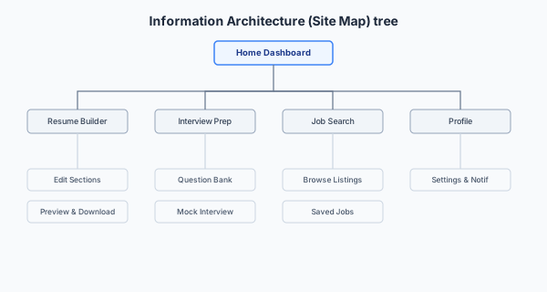
      An IA diagram represents the system as a tree: each node is a screen or section, and edges show navigation relationships. IA diagrams are used early in the UCD cycle to agree on structure before detailed design begins.

      Information Architecture Sitemap: Hierarchical tree diagram showing Home Dashboard decomposing into Resume Builder, Interview Prep, Job Search, Networking, and Profile nodes.

      Worked Example: Career-Guidance App (2025 style)

      Home Dashboard
      ├── Resume Builder
      │   └── Edit Sections (Summary, Experience, Education, Skills)
      │   └── Preview & Download
      ├── Interview Prep
      │   ├── Question Bank
      │   └── Mock Interview Mode
      ├── Job Search
      │   ├── Browse Listings
      │   └── Saved Jobs
      ├── Networking Tips
      └── Profile
          └── Settings & Notifications

      The IA answers the structural questions: how many top-level sections? How deep is the hierarchy? Which items are siblings vs children? These decisions should be validated through user research (card sorting), not designer intuition.

      Common IA Usability Issues

      When asked to identify and evaluate an IA issue, follow the three-step pattern: name the issue → point to where it occurs in the given system → propose a usability study (with method, participants, data, and analysis) to confirm whether it is genuinely a problem.

      IssueExplanationRelates to
      Ambiguous labelsUsers cannot tell which section contains what they need. “Reports” vs “Submissions” might mean the same thing to the designer but different things to users.Card sorting reveals how users naturally name and group concepts.
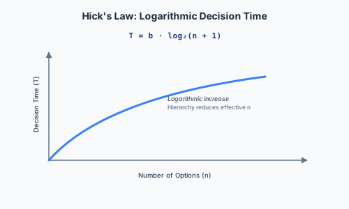
      Too many top-level categoriesIncreases cognitive load at the point of navigation. The user must scan many options to decide where to go.Hick’s Law: more options → slower decisions. Grouping into fewer top-level categories reduces the effective nn at each decision point.
      Important functions buried too deepFunctions that users need frequently require multiple taps to reach, violating efficiency and increasing errors.Usability goal: Efficiency. Nielsen Heuristic #7: Flexibility and Efficiency of Use.
      Inconsistent labellingThe same function is called different names on different screens — or different functions share the same name.Violates Nielsen Heuristic #4: Consistency and Standards. Also increases LTM encoding burden (memory note).
      Poor navigation feedbackUsers do not know where they are within the hierarchy.Breadcrumbs, highlighted current-section indicators, and consistent page titles address this.

      IA and Card Sorting

      Card sorting directly informs IA design. Open card sorts (participants create their own groups) are used to discover a new IA. Closed card sorts (predefined groups, participants only assign cards) are used to validate an existing IA. The similarity analysis (covered in the Evaluation section) provides the quantitative basis for grouping decisions — cards that a high percentage of users co-group should be co-located in the final hierarchy.

      Expected Learning

      • Define IA and its four components (organisation, labelling, navigation, search).
      • Draw an IA diagram for a described system as a labelled tree.
      • Name at least four common IA usability issues and link each to a relevant theory (Hick’s Law, Nielsen’s heuristics, memory constraints).
      • Explain how card sorting informs IA design (open for discovery, closed for validation).
      • Apply the three-step IA issue pattern: name the issue → locate it → propose a usability study to confirm.

      Past Paper Questions

      IA appears in: 2025 Q5 (career-guidance app — IA diagram), 2023 Q5 (CamCORS — IA issue and evaluation study). Card sorting and similarity analysis (directly informing IA) appears in 2019 Q5.

  • Mathematical Laws of Interaction

    Fitts' Law (MT = a + b log₂(2D/W)), Hick's Law (T = b log₂(n+1)), KLM (Keystroke-Level Model — K, P, H, M, R operator times), and GOMS (Goals, Operators, Methods, Selection rules) with worked examples and limitations

    • Fitts' Law and Hick's Law

      Fitts’ Law

      Fitts’ Law predicts the time required to point at a target of a given size at a given distance:

      MT=a+blog2 ⁣(2DW)\text{MT} = a + b\log_2\!\left(\frac{2D}{W}\right)

      Where:

      • MT is movement time.
      • D is the distance from the starting point to the centre of the target.
      • W is the width of the target measured along the axis of motion.
      • aa and bb are empirically fitted constants (device- and user-dependent).
      • log2(2D/W)\log_2(2D/W) is the Index of Difficulty (ID) — measured in bits.
      Fitts' Law Curve: Movement Time (MT) plotted against the Index of Difficulty, showing a linear relationship.

      Core insight: pointing time increases with distance and decreases with target width. Make frequently-used or high-value targets large and close to the current cursor or finger position.

      Semantic Pointing

      Semantic pointing exploits Fitts’ Law by modifying the effective mapping between input motion and screen motion. More likely targets are given greater effective width and reduced effective distance (independent of their visible size), speeding up pointing without changing the visual layout. The cursor slows down over probable targets and speeds up across empty space — an algorithmic, not visual, application of Fitts’ Law.

      Design Implications

      • Put frequently-used controls at screen edges — the edge acts as an infinite target in one dimension (you cannot overshoot).
      • On mobile, place key actions within the thumb’s natural reach zone (the lower portion of the screen).
      • Avoid tiny, closely-spaced touch targets — the “fat-finger problem”: an adult fingertip is roughly 10–14 mm wide, so targets smaller than this are physically difficult to hit accurately.

      Hick’s Law (Hick–Hyman Law)

      Hick’s Law predicts the time required to make a decision among nn equally likely alternatives:

      T=blog2(n+1)T = b\log_2(n+1)

      Hick's Law Curve: Decision Time (T) plotted against the number of alternatives log₂(n+1), showing a logarithmic curve.

      Core insight: decision time increases (logarithmically) with the number of choices presented simultaneously. Do not overwhelm users with too many options — large flat menus slow decision-making.

      Design mitigation: grouping or hierarchy (chunking) reduces the effective nn at each decision point. Rather than presenting 12 menu items in one flat list (n=12n=12), group them into 3 categories of 4 (n=3n=3 at the first level, then n=4n=4 at the second). Because log2\log_2 is concave, log2(4)+log2(5)<log2(13)\log_2(4) + \log_2(5) < \log_2(13), so the hierarchical structure is predicted to be faster — provided the user understands the grouping.

      Worked Example: Comparing Two Layouts

      Given Layout A (a single flat list of 6 menu options spread across the screen) vs Layout B (the same 6 options grouped into 2 categories of 3, in a tighter cluster):

      Hick’s Law analysis: Layout B requires an initial choice between 2 categories (n=2n=2), then 3 items (n=3n=3) — two smaller decisions rather than one n=6n=6 decision. Predicted decision time is lower for Layout B, provided the grouping matches the user’s mental categorisation.

      Fitts’ Law analysis: Layout B’s tighter clustering reduces average distance DD between commonly-used controls, further reducing predicted movement time — assuming target widths WW are not reduced disproportionately by the tighter packing.

      Combined prediction: Layout B is faster for both decision-making and pointing, provided the grouping is intuitive. If the grouping is arbitrary (does not match the user’s mental model), the extra navigation step could increase search time and errors — a limitation neither law captures, because neither models learnability or confusion.

      Expected Learning

      • State Fitts’ Law and Hick’s Law with their formulae.
      • Explain why edges and corners are fast targets (infinite effective width).
      • Given two candidate layouts, compare them using both laws, stating the assumptions and limitations of the prediction.
      • Explain why grouping reduces effective nn and how the concave log2\log_2 function makes hierarchical menus faster than flat ones.
      • Distinguish what these laws do predict (expert motor and decision time) from what they do not (learnability, errors, satisfaction).

      Past Paper Questions

      Fitts’ and Hick’s Laws appear in: 2018 Q6(c) (layout comparison using both laws). The mathematical predictions are straightforward — the marks come from applying the laws correctly to the specific numbers in the scenario and acknowledging their limitations.

    • KLM, GOMS, and Predictive Modelling

      The Keystroke-Level Model (KLM)

      KLM predicts the time an expert user takes to complete a well-defined, error-free task by summing unit operator times:

      OperatorSymbolTypical TimeDescription
      Keystroke / button pressKK~200 msPressing a key or tapping a button. Varies by typing skill.
      PointingPPFitts’ LawMoving the cursor or finger to a target. Estimated via Fitts’ Law, not a fixed constant.
      HomingHH~400 msMoving the hand between mouse and keyboard.
      Mental preparationMM~1350–1500 msThe cognitive preparation before a chunk of automated action — deciding what to do next.
      System responseRRDepends on systemWaiting for the computer to respond.

      Total predicted time == \sum (operator times). The analyst decomposes the task into a sequence of these operators, sums the times, and compares across alternative designs.

      The M-Operator Placement Heuristics

      The mental operator MM is the trickiest to place — it represents a conscious cognitive chunk. Standard heuristics for inserting MM operators:

      • Before every chunk of actions that form a single cognitive unit.
      • Before every decision point (choosing between methods).
      • Not between actions that are part of the same automated motor sequence (e.g. typing a memorised word — one MM before the word, not one per letter).

      Worked KLM Example

      For the task “save the current document using Ctrl+S”:

      • MM (decide to save): 1350 ms
      • KK (Ctrl key): 200 ms
      • KK (S key): 200 ms
      • Total: 1750 ms

      For the same goal using the mouse: File menu → Save:

      • MM (decide to save): 1350 ms
      • HH (hand to mouse): 400 ms
      • PP (point to File menu): estimated via Fitts’ Law
      • KK (click File): 200 ms
      • PP (point to Save): via Fitts’ Law
      • KK (click Save): 200 ms
      • Total: substantially longer, dominated by homing and pointing time.

      This comparison explains why keyboard shortcuts are faster for experts — they eliminate homing and pointing operators, at the cost of requiring recall (the user must remember the shortcut, which KLM does not model).

      GOMS: Goals, Operators, Methods, Selection Rules

      GOMS generalises KLM into a full cognitive architecture:

      ComponentDescription
      GoalsWhat the user wants to accomplish — the top of the hierarchy.
      OperatorsThe atomic actions available to the user — keystrokes, mouse movements, mental operators (the same set as KLM).
      MethodsLearned procedures — sequences of operators — for achieving a goal. An expert has multiple methods for the same goal.
      Selection RulesWhen more than one method exists, rules for choosing between them. “If the hand is already on the mouse, use the menu. If on the keyboard, use the shortcut.”

      GOMS is used to predict expert task-completion time and to compare alternative interface designs before either is built, provided the task is well-defined, repetitive, and performed by an expert executing a known method.

      Three (Plus One) Limitations of GOMS/KLM

      These limitations are highly examinable (2018 Q5c directly asks for three):

      1. Expert-only assumption: GOMS/KLM assumes the user already knows the optimal method — it says nothing about learnability, novice behaviour, exploration, or errors. A novice who does not know the shortcut exists will use the slower menu method, and KLM cannot predict this.

      2. No error modelling: real usage includes mistakes, hesitation, recovery, and backtracking — none of which GOMS/KLM captures. A system that is theoretically faster (in error-free expert use) but more error-prone may be slower in practice.

      3. Requires a fully-specified, repetitive task: unsuitable for exploratory, creative, or highly variable activities (cf. Cognitive Dimensions, which was designed for precisely this situation). If the user’s goal is not known in advance, the method cannot be decomposed.

      4. Mental preparation time (MM) is a coarse average: it varies substantially by individual, task familiarity, fatigue, and context, reducing predictive precision for any one user in any one session. The model gives a population-level estimate, not an individual-level prediction.

      Expected Learning

      • State the five KLM operators (K,P,H,M,RK, P, H, M, R) with typical times.
      • Decompose a described task into KLM operators and estimate total time.
      • Explain why keyboard shortcuts are faster than menu navigation in KLM terms.
      • Define GOMS and its four components (Goals, Operators, Methods, Selection Rules).
      • Name and explain three limitations of GOMS/KLM, linking each to what the model cannot predict.
      • Compare GOMS/KLM with Cognitive Dimensions: when is each the appropriate analysis tool?

      Past Paper Questions

      GOMS/KLM appears in: 2018 Q5(c) (explain GOMS, list steps, describe KLM, three limitations). KLM may appear in any question requiring comparison of two interaction methods for an expert user performing a repetitive task.

  • Evaluation Methods

    Heuristic Evaluation (Nielsen's 10 heuristics, 3–5 independent evaluators, severity ratings 0–4), Cognitive Walkthrough (the four questions, procedure, HE vs CW comparison), evaluation frameworks (formative vs summative, analytical vs empirical, RCTs, sign tests, internal/external validity, Hawthorne effect), and card sorting with similarity analysis

    • Heuristic Evaluation (HE)

      What Is Heuristic Evaluation?

      Heuristic Evaluation is an analytical, expert-based usability inspection method. Evaluators examine an interface and judge its compliance with a small set of established usability principles (heuristics). It requires no users, no working system, and relatively little time — making it one of the most cost-effective evaluation methods.

      Best practice: use 3–5 independent evaluators. Nielsen’s research shows a single evaluator finds only ~35% of usability problems; 3–5 evaluators find the large majority at reasonable cost. Evaluators must work independently before their findings are aggregated, to avoid groupthink.

      Nielsen’s 10 Heuristics — Full Reference

      #HeuristicWhat to look for
      1Visibility of System StatusKeep users informed via timely, appropriate feedback. Loading indicators, progress bars, confirmations. Violation: no feedback after clicking a button — the user does not know if the action was received.
      2Match Between System and the Real WorldSpeak the user’s language, not internal jargon. Follow real-world conventions. Violation: raw technical error codes shown to non-technical end users.
      3User Control and FreedomSupport undo/redo. Provide clearly marked “emergency exits” — users need a way out. Violation: no way to undo an irreversible “delete all” action.
      4Consistency and StandardsFollow platform conventions (iOS HIG, Material Design). Be internally consistent — the same action should look and behave the same way everywhere. Violation: the same function labelled differently on different screens.
      5Error PreventionDesign to prevent problems before they occur. Confirmation dialogues for destructive actions, input validation, disabling invalid options. Better than a good error message. Violation: no confirmation before an irreversible deletion.
      6Recognition Rather Than RecallMinimise memory load by making objects, actions, and options visible. Violation: requiring users to remember commands with no visible hints (echoes the Memory lecture).
      7Flexibility and Efficiency of UseProvide accelerators (shortcuts, gestures) for expert users, invisible to novices. Allow customisation. Violation: all users must navigate full menus for every action — no shortcuts exist.
      8Aesthetic and Minimalist DesignDialogues should not contain irrelevant or rarely-needed information. Every extra element competes for attention. Violation: an overwhelming first-run screen with too many simultaneous options.
      9Help Users Recognise, Diagnose, and Recover from ErrorsPlain-language error messages that precisely state the problem and suggest a solution. Violation: “Error 404” with no explanation or next step.
      10Help and DocumentationEven though the ideal system needs no explanation, provide easily searchable, task-focused help. Violation: no help section, or one hidden several clicks deep.

      HE Procedure

      1. Brief evaluators on the 10 heuristics and the intended context of use / user population. Evaluators do not need to be the designers.
      2. Each evaluator inspects independently — no discussion during evaluation.
      3. For each problem found, record: which heuristic(s) are violated, precisely where the violation occurs in the interface, and a severity rating (0–4).
      4. Aggregate findings across evaluators; merge duplicates.
      5. Prioritise for redesign by severity × frequency. A severity-4 problem affecting a core user journey takes priority over a severity-2 cosmetic issue on a rarely-visited settings page.

      Severity Rating Scale (0–4)

      RatingMeaning
      0Not a usability problem at all.
      1Cosmetic only — fix if time allows.
      2Minor usability problem — low priority.
      3Major usability problem — important to fix.
      4Usability catastrophe — must fix before release.

      Severity combines frequency (how often is it encountered?), impact (how hard is it to overcome?), and persistence (one-time annoyance or recurring obstacle?).

      Worked Example: HE of Microsoft Teams (2025 Q6a)

      ProblemHeuristic Violated & Reasoning
      Buffering/long loading on brief internet interruption#1 Visibility of System Status — no clear feedback about connection state or load progress
      No demonstration of common tasks for new users#10 Help and Documentation — novices are left unsupported with no onboarding
      No wizard guiding users starting an activity#6 Recognition Rather Than Recall — users must remember how to start, with nothing visible to prompt them
      Layout not ordered to match task steps#2 Match Between System and Real World — on-screen order does not mirror the real workflow
      Untrained users struggle with numerous/complex features#7 Flexibility and Efficiency of Use — caters to experts with no progressive disclosure for novices
      No advanced search feature#7 — experts lack a shortcut to precise retrieval; all users must browse
      New posts overwrite/bury important files & assignments#8 Aesthetic and Minimalist Design (also #1) — important information lacks visual hierarchy
      Left-hand navigation hard to reach on mobile#2 / platform conventions — mobile convention favours bottom/thumb-zone navigation; a desktop pattern was ported unchanged

      Should You Combine Heuristics?

      A known debate: fewer heuristics are faster to learn and apply, speeding up evaluation. However, combining conceptually distinct heuristics risks missing subtle issues — e.g. merging #1 (Visibility) and #9 (Error Recovery) under “feedback” might cause evaluators to overlook visibility problems that are not framed as errors. The trade-off is completeness vs practicality: for a quick sanity check, a reduced set may suffice; for a formal, reproducible audit, the full 10 should be retained.

      Expected Learning

      • Name all 10 of Nielsen’s heuristics with a one-sentence description of each.
      • Given an interface description or screenshot, identify specific violations, naming the heuristic, the location, and the reasoning.
      • Apply a severity rating (0–4) to each violation and justify the rating.
      • Explain why evaluators must work independently and why 3–5 evaluators is the empirically-supported sweet spot.
      • Discuss the trade-off of combining heuristics (completeness vs speed/practicality).

      Past Paper Questions

      HE appears in almost every Tripos sitting: 2025 Q6a (Teams), 2024 Q5 (ChatGPT), 2021 Q5, 2020 Q5d, 2019 Q5, 2018 Q5, 2017 Q6c. HE is the single most frequently examined topic on the paper — be fluent with all 10 heuristics and the procedure.

    • Cognitive Walkthrough (CW)

      What Is a Cognitive Walkthrough?

      Cognitive Walkthrough is an analytical inspection method that simulates a (novice) user’s problem-solving process, step by step through a specific task, to identify learnability issues. It is grounded in the theory that novice users learn largely through unassisted exploration — “user interaction as search” (a first-wave HCI, goal-based model).

      Unlike HE (which audits broadly), CW is task-specific and learnability-focused. It asks: “can a first-time user figure out how to complete this task without training or documentation?”

      The Four Questions

      At each step in the action sequence, the evaluator asks:

      1. Will the user try to achieve the right effect? — Do they know what they are trying to do at this point? Is the goal clear?
      2. Will the user notice that the correct action is available? — Is the required control visible and salient, not buried, hidden, or off-screen?
      3. Will the user associate the correct action with the desired effect? — Is the label, icon, or position meaningful given their current goal? Does the label match the user’s vocabulary?
      4. If the action is performed correctly, will the user see that progress is being made? — Is feedback adequate and unambiguous? Does the system confirm that the step was successful?

      CW Procedure

      1. Define the target user population and their assumed prior knowledge (e.g. “a first-year student who has never used a career-guidance app before”).
      2. Choose a representative, concrete task (e.g. “create a new CV using the Resume Builder”).
      3. Decompose the task into an action sequence — the same HTA decomposition used for task analysis.
      4. For each action, answer all four questions. Record Success or Fail with a brief justification for each.
      5. Every Fail identifies a specific usability problem — document it precisely.
      6. Convert each failure into a concrete redesign suggestion — do not just identify the problem; propose a fix.

      Worked Example: CW of a Weather App

      Task: View detailed weather forecast for “Field Day” event

      ActionCW Analysis
      1. Locate “Field Day” event on the main screen list.Q1 OK — the user knows they need to find the event. Q2 Possible fail — is the event clearly visible and distinguishable from others (contrast, ordering, proximity)?
      2. Tap “Field Day” to open its details.Q3 Possible fail — no clear affordance cue (e.g. a chevron ›) signals the row is tappable. The user may not associate tapping the name with “open details.” Q4 OK if a smooth screen transition confirms the action.
      3. Find the “Weather Forecast” section within event details.Q2 Possible fail if the forecast is not prominently labelled or sits below the fold (requires scrolling). Q3 Possible fail if the label wording (“Weather” vs “Forecast”) is ambiguous relative to the user’s mental goal wording.
      4. Read the detailed forecast data.Q4 OK once the data is visibly rendered.

      From CW Failures to Redesign Suggestions

      • No affordance cue on a tappable row → add a chevron icon (›) or subtle underline to signal interactivity.
      • Ambiguous label “Weather” → rename to “Detailed Forecast” and add a weather glyph icon.
      • No loading feedback → add a progress spinner while data is fetched (Nielsen #1).
      • Input accepts an impossible value → add input validation with a sensible maximum (Nielsen #5, Error Prevention).

      HE vs CW: When to Use Which

      CriterionHeuristic EvaluationCognitive Walkthrough
      FocusBroad usability audit across the whole interfaceFocused, task-by-task learnability analysis
      Expertise requiredUsability experts familiar with the heuristicsEvaluators who understand the target users’ goals (less specialist training needed)
      OutputList of violations, each tagged to a heuristic and severityStep-by-step trace of task success/failure with named causes
      Best for novel/unconventional systemsWeaker — no established conventions to compare against the heuristicsStronger — CW needs no prior convention, just a task and a user model (e.g. a colour-to-sound wearable, 2020 paper)
      Best for a fast general surveyStronger — broad coverage relatively quicklyWeaker — CW only covers the specific task(s) chosen
      Fidelity requiredWorks even on a rough prototypeNeeds the action sequence to be walkable; benefits from at least a clickable prototype

      Expected Learning

      • State the four CW questions and explain what each reveals about the interface.
      • Perform a CW on a described task, decomposing it into actions and answering all four questions for each, recording Success/Fail with justification.
      • Convert CW failures into specific, actionable redesign suggestions.
      • Compare HE and CW: when is each the stronger method, and why?
      • Explain why CW is stronger than HE for novel, unconventional interaction paradigms where no established conventions exist.

      Past Paper Questions

      CW appears in: 2025 Q5 (CW on own career-guidance design + redesign), 2022 Q5 (CW instruction sheet), 2021 Q6 (CW on weather app — 5 tasks + redesign), 2020 Q5d (HE vs CW for a sensory-substitution device), 2019 Q5b (HE vs CW choice criteria). The Supervision 2 material includes a worked CW of the ikea.com purchase flow.

    • Evaluation Frameworks, RCTs, and Validity

      The Two Core Distinctions

      Evaluation methods can be classified along three independent axes. Knowing which quadrant a method occupies is essential for choosing between methods and comparing them in exam answers.

      Evaluation Framework: Formative vs. Summative × Analytical vs. Empirical quadrant mapping common HCI evaluation methods.

      Formative vs Summative

      FormativeSummative
      WhenEarly in the UCD cycle, while designs are still being shapedLate, when the design is (near) final
      PurposeCompare alternatives, identify weaknesses, guide improvementTest against predefined, closed criteria; measure whether targets were met
      Question typeOpen: “what problems exist?”Closed: “does this design meet the 95% task-completion-rate target?”

      Analytical vs Empirical

      AnalyticalEmpirical
      BasisApplying a theory or framework to the designObserving and measuring real users interacting with the design
      Requires users?No — the evaluator alone can apply the frameworkYes — real or representative users must be observed
      ExamplesHeuristic Evaluation, Cognitive Walkthrough, Cognitive Dimensions, KLM/GOMSThink-aloud protocols, interviews, field observation, controlled experiments, A/B testing

      Quantitative vs Qualitative

      QuantitativeQualitative
      Data typeNumbers — enabling statistical comparisonWords, images, audio/video — requiring coding or thematic analysis
      AnalysisStatistical tests (t-test, sign test, ANOVA)Thematic analysis, grounded theory, affinity diagramming

      Cross-Tabulation Example

      This gives a useful mental map:

      • CW and CDs are qualitative-analytical.
      • KLM is quantitative-analytical.
      • Think-aloud protocols, interviews, and field observation are qualitative-empirical.
      • A/B tests and lab trials are quantitative-empirical.

      Randomised Controlled Trials (RCTs) and A/B Testing

      An RCT in HCI requires:

      1. A performance measure — time on task, error rate, task completion rate, or a standardised instrument (e.g. SUS — System Usability Scale).
      2. A representative sample of the target population who have given informed consent.
      3. An experimental task that yields comparable performance data.

      A/B testing is the online, large-scale variant: different users are randomly assigned to different interface versions (A and B), and their behaviour (click-through rate, conversion, dwell time) is compared.

      Statistical Testing

      The null hypothesis H0H_0: any observed difference between conditions is due to random variation, not the design change.

      • Parametric tests (e.g. t-test) assume normally-distributed data — an assumption that often does not hold for small HCI samples.
      • Non-parametric alternatives (e.g. the sign test) make fewer assumptions: for each participant in a within-subjects design, record whether the new design was faster (+) or slower (−). Then test whether the proportion of + signs departs from 50/50 by more than would be expected by chance.

      Always report confidence intervals / error bars alongside point estimates of the effect size. A statistically significant result is not automatically an interesting one — very small effects can be “significant” with enough data. HCI research typically prioritises large effect sizes over bare statistical significance.

      Internal vs External Validity

      TypeQuestionThreats
      Internal validity”Was the study done right?” — covers reproducibility, scientific integrity, and refutability (could the hypothesis have failed the test?).Confounding variables (e.g. the new design also used a larger font — was the improvement from the design or the font?). Experimenter bias. Inconsistent procedure across participants.
      External validity”Does the study tell us something useful about the real world?”Unrepresentative sample (all participants are university students — do findings generalise to older users?). Artificial task (lab-based, no time pressure — does performance predict real-world use?).
      Ecological validity (sub-case of external)“Did the study setting resemble real conditions?”Lab-based observation of a mobile app while the participant sits at a desk, undistracted — does this predict use while walking, one-handed, in sunlight?

      The Hawthorne Effect

      The Hawthorne Effect (named after 1920s factory-lighting studies at the Hawthorne Works) occurs when participants change their behaviour simply because they know they are being observed — not because of the experimental manipulation. In the original studies, productivity rose whether lighting was increased or decreased, because workers responded to the attention, not the lighting.

      In HCI, this threatens any evaluation where the experimenter is visibly present:

      • A participant may persist longer with a confusing interface because they feel observed and do not want to “give up.”
      • A participant may rate a design more favourably because they know the experimenter is its designer.
      • The “new and interesting” version may receive a temporary enthusiasm boost unrelated to genuine usability improvement.

      Mitigation: remote, unmoderated testing; between-subjects designs where possible; standardised, validated instruments (e.g. SUS) rather than ad-hoc rating scales.

      Expected Learning

      • Distinguish formative from summative, analytical from empirical, and quantitative from qualitative evaluation, classifying given methods correctly.
      • Describe what an RCT requires (performance measure, representative sample, informed consent, experimental task).
      • Explain the sign test as a non-parametric alternative to the t-test for within-subjects HCI experiments.
      • Distinguish internal validity from external validity (including ecological validity as a sub-case).
      • Explain the Hawthorne Effect and how it threatens the validity of usability evaluations.
      • Understand that statistical significance ≠ practical importance — report effect sizes.

      Past Paper Questions

      RCTs, validity, and the Hawthorne Effect are assessed in: 2020 Q5 (evaluating quantitative findings; sample generalisation), 2019 Q5 (card sorting and similarity analysis — a quantitative-empirical task). The Supervision 2 material includes designing a usability testing research plan with these concepts.

    • Card Sorting and Similarity Analysis

      What Is Card Sorting?

      Card sorting asks participants to sort physical or digital cards (each labelled with a piece of content, a function, or a concept) into groups that make sense to them. It reveals users’ natural mental models for organising information and directly informs Information Architecture.

      TypeProcedureUsed for
      Open card sortParticipants create and name their own groups. No predefined categories.Discovering a new IA — you do not yet know how users categorise the content.
      Closed card sortGroups are predefined by the researcher; participants only assign cards to them.Validating an existing IA — testing whether the proposed categories match user expectations.

      Similarity Analysis

      The quantitative output of a card-sorting study is a similarity matrix — for every pair of cards (A,B)(A, B), compute:

      Similarity(A,B)=number of participants who placed A and B in the same grouptotal number of participants×100%\text{Similarity}(A,B) = \frac{\text{number of participants who placed } A \text{ and } B \text{ in the same group}}{\text{total number of participants}} \times 100\%

      Interpretation:

      • High similarity (100%\to 100\%): most users consistently co-group those cards — they should be co-located in the final IA.
      • Low similarity: users hold varied mental models — the cards may not belong together, or the concept is ambiguous. A single IA hierarchy will not satisfy all users.
      • Mixed similarity across pairs: indicates genuine variation in mental models — further testing (or a larger sample) is needed before committing to a final IA.

      Worked Example: 4 Cards, 3 Users (2019 Q5c Style)

      Given the following groupings from three participants:

      • User A: {1,4}, {2,4}, {1}
      • User B: {1,2,3}, {1,2,4}, {3,4}
      • User C: {1,3}, {4}, {3,4}

      We count for each pair which users placed them in the same group at least once:

      PairCo-grouped bySimilarity
      (1,2)B only (appears together in {1,2,3} and {1,2,4})1/333%1/3 \approx 33\%
      (1,3)B ({1,2,3}), C ({1,3})2/367%2/3 \approx 67\%
      (1,4)A ({1,4}), B ({1,2,4})2/367%2/3 \approx 67\%
      (2,3)B only ({1,2,3})1/333%1/3 \approx 33\%
      (2,4)A ({2,4}), B ({1,2,4})2/367%2/3 \approx 67\%
      (3,4)B ({3,4}), C ({3,4})2/367%2/3 \approx 67\%

      Commentary: pairs (1,3), (1,4), (2,4), and (3,4) show moderate agreement (67%); pairs (1,2) and (2,3) show weaker agreement (33%). No pair reaches 100% consensus — genuine variation in mental models. A reasonable IA might treat {1,3,4} as a loosely overlapping cluster with card 2 more weakly attached (mainly via card 4).

      Critical caveat: with only n=3n=3 participants, this sample is far too small to commit to a final structure with confidence. The study should be repeated with more participants before the IA is finalised.

      Exam Tips for Card Sorting Questions

      1. Always show your working for every pair — even where the arithmetic is straightforward. Method marks are awarded per pair.
      2. Use the formula explicitly — state it, then substitute the numbers.
      3. End with an explicit IA recommendation — which cards should be co-located based on the similarity data?
      4. Always comment on sample size — is nn large enough to draw firm conclusions? If not, state that explicitly.
      5. Link back to IA principles — how does this similarity matrix inform the organisation system, labelling system, and navigation structure?

      Card Sorting and the UCD Cycle

      Card sorting fits into the UCD cycle at the mid-stage: after requirements and initial user research, before detailed prototyping. The similarity matrix from card sorting directly determines the IA tree, which then feeds into wireframing and prototyping.

      Card sorting is often complemented by:

      • Interviews to understand why users group items as they do.
      • Tree testing (reverse card sort) to validate the proposed IA: users are given the IA tree and asked where they would find a specific item — testing navigation effectiveness, not grouping preference.

      Expected Learning

      • Distinguish open from closed card sorts and explain when each is appropriate.
      • Apply the similarity formula to a given set of user groupings, computing the similarity for every card pair.
      • Interpret a similarity matrix: identify strong clusters, weak associations, and areas of user disagreement.
      • Recommend an IA structure based on similarity data, with explicit caveats about sample size.
      • Explain how card sorting fits into the UCD cycle and what other methods complement it.

      Past Paper Questions

      Card sorting and similarity analysis appears in 2019 Q5(c) (4 cards, 3 users — compute similarity for all pairs, comment on implications for IA). The similarity formula and the importance of showing working are explicit exam requirements.

  • Designing Meaningful and Complex Systems

    The three waves of HCI (first-wave efficiency, second-wave socio-technical, third-wave emotion/meaning), design ethnography, wicked problems (Rittel & Webber's 10 characteristics), goal-oriented interaction (interaction as search, bounded rationality, satisficing, heuristics and biases, Attention Investment Theory), and persuasive design

    • The Three Waves of HCI

      A Broadening Discipline

      Human-Computer Interaction has evolved through three overlapping “waves” (or paradigms). Each wave introduced new theories, methods, and values — not to replace earlier ones, but to broaden the discipline’s toolkit. The waves are cumulative: first-wave methods remain the right choice for first-wave problems; second-wave methods for second-wave problems.

      Timeline of the three waves of HCI: First wave (1980s) — Human Factors and cognitive science, efficiency focus. Second wave (1990s) — sociology and ethnography, socio-technical systems. Third wave (2000s onwards) — art, philosophy, design, emotion and meaning.

      First Wave (1980s): Efficiency and Human Factors

      Core theories: Human Factors Engineering, Ergonomics, Cognitive Science.

      Key assumptions:

      • The “user interface” is a separate module, designed independently of the system’s core functionality.
      • The human is an operator performing well-defined, measurable tasks.
      • The primary goal is efficiency — speed and accuracy, minimising errors.
      • The user’s cognitive processes can be modelled as information processing.

      Typical example: a control panel of switches, dials, and lamps. An air-traffic control display.

      Key principles: group related information; structure sequences of operation; make important controls large and salient (Fitts’ Law); keep task sequences short (KLM).

      Methods: task analysis (HTA), GOMS/KLM, lab-based controlled experiments, Cognitive Walkthrough.

      Second Wave (1990s): Context and Socio-Technical Systems

      Core theories: Anthropology, Sociology, Work Psychology, Participatory Design.

      Key shift: computers are understood as one part of a socio-technical system — not a standalone tool. The context of use (the office, the hospital ward, the factory floor) is inseparable from the design.

      Typical example: an open-plan office with paper notes, noticeboards, shared whiteboards, and physical coordination artefacts alongside digital systems. The interaction includes how people coordinate around and through the technology, not just how they operate the GUI.

      Key principles: study the context before designing; involve users in the design process (participatory design); the system must fit the existing workflow, not demand the workflow change to fit the system.

      Methods: ethnography, contextual inquiry, prototyping, participatory design workshops, focus groups.

      Third Wave (2000s onwards): Emotion, Meaning, and Experience

      Core theories: Art, Philosophy, Design, Phenomenology.

      Key shift: computing escapes the workplace. With the web, smartphones, and ubiquitous computing, systems are used in all aspects of life — and outside the workplace, efficiency is not the priority and usage is discretionary. Users do not have to use your app; they choose to (or not).

      New concerns:

      • Emotion: how does the system make the user feel? Anxious? Empowered? Delighted?
      • Aesthetics: is it beautiful? Does beauty affect perceived usability?
      • Meaning: what does this system mean to its users? Does it help them be social, creative, or feel in control?
      • Ethics: what are the unintended social consequences of this design?

      Typical example: a speculative or critical design artefact (e.g. the “blood-bag radio” — a radio powered by a blood bag, designed to provoke questions about energy consumption). A mindfulness app designed to reduce anxiety.

      Methods: experience prototyping, cultural probes, reflective design, aesthetic evaluation, speculative and critical design.

      Using the Three Waves in an Exam Answer

      When asked to analyse or design for a specific system, identify which wave’s concerns dominate:

      • An air-traffic control system is a first-wave problem: safety-critical, efficiency-driven, task-based, expert users. Prioritise task analysis, KLM, and error prevention.
      • A hospital ward communication system is a second-wave problem: socio-technical, context-dependent, multiple stakeholder types. Prioritise ethnography, contextual inquiry, and participatory design.
      • A mental-health support app is a third-wave problem: emotional, discretionary, meaningful. Prioritise UX goals over usability goals; the user’s emotional experience matters more than task-completion time.

      The mark-scoring insight: no system is purely one wave. A hospital system needs efficiency (first wave), contextual understanding (second wave), and must not make patients feel dehumanised (third wave). The best answers acknowledge which wave’s concerns dominate while showing awareness of the others.

      Expected Learning

      • Name the three waves of HCI with their time periods, core theories, and typical examples.
      • For a given system, identify which wave’s concerns dominate and justify with reference to the system’s characteristics.
      • Explain that the waves are cumulative, not replacements — each added new methods without rendering earlier ones obsolete.
      • Provide a balanced analysis showing awareness of multiple waves even when one dominates.

      Past Paper Questions

      The three waves explicitly underlie the 2017 Q5(b) question on “interaction spaces beyond the desktop” (Winograd’s classification) and inform the choice of evaluation methods in later years (e.g. 2020 Q5d: HE vs CW for a sensory-substitution device — a third-wave system where CW is stronger because HE has no established conventions to compare against).

    • Ethnography and Wicked Problems

      Design Ethnography

      Design ethnography offers a holistic, in-context understanding of how life works, so that it can be supported, enhanced, or changed. An ethnographic study observes people in their normal environment over a substantial period, documenting activities and artefacts through photos, video, audio recordings, and field notes.

      Outputs are diverse and depend on the research question: task-flow diagrams, journey maps, concept-generation maps, activity timelines, written reports, and “thick” (richly detailed, experiential) descriptions.

      What Ethnography Helps Teams Understand

      Ethnography answers two distinct kinds of question:

      (A) What things happen: everyday life, current experiences with technology, people’s own strategies for getting things done — including workarounds, adaptations, and informal practices invisible in an interview.

      (B) How things matter: how products help people be social, make meaning, feel in control, express identity, or manage their emotional state. This second question is distinctly third-wave — it asks about significance, not just activity.

      Mixed Methods

      Ethnography is not used in isolation. A common pattern:

      1. Quantitative survey to identify trends and segment the user population.
      2. Ethnographic fieldwork with a subset of respondents to investigate in depth the interesting questions the quantitative data raises.
      3. Member-checking: showing findings back to participants — “is this what your experience is like?” — to validate the interpretation.

      This triangulation ensures the ethnographically-studied group is representative of the wider population, while using ethnography’s depth to explain the quantitative patterns.

      Wicked Problems

      Rittel and Webber (1973) identified a class of problems that resist classical engineering solution methods. Unlike “tame” problems (solving a quadratic equation, designing a bridge to a given specification), wicked problems have no definitive formulation, no stopping rule, and no true-or-false test of a solution.

      The Ten Characteristics of a Wicked Problem

      1. There is no definitive formulation of the problem — understanding the problem and solving it are the same activity, because every attempt to define it reveals new dimensions.
      2. Wicked problems have no stopping rule — you never “finish”; you stop when resources run out, when the result is “good enough,” or when you lose patience.
      3. Solutions are not true-or-false, but good-or-bad — judged qualitatively by stakeholders with different values.
      4. There is no immediate and no ultimate test of a solution — consequences ripple out over time and cannot be fully predicted.
      5. Every solution is a “one-shot operation” — no opportunity for trial and error without real consequences.
      6. There is no enumerable set of potential solutions.
      7. Every wicked problem is essentially unique.
      8. Every wicked problem can be considered a symptom of another problem — e.g. “low engagement with the health app” is a symptom of “users find health tracking demotivating,” which is a symptom of “the app’s feedback triggers shame.”
      9. A discrepancy can be explained in numerous ways, and the choice of explanation determines the resolution.
      10. The designer has no right to be wrong — real people bear the consequences.

      Examples of wicked problems: reducing loneliness in elderly populations; improving public health through behaviour change; slowing climate change; designing a social-media platform that promotes well-being rather than anxiety.

      Design Implication

      For wicked problems, goal-directed task models (HTA, GOMS, CW) are the wrong tool. These models assume a well-defined goal with a measurable path to it. A wicked problem cannot be decomposed into sub-goals because the goal itself is contested and evolving.

      Instead, favour reflective, iterative, and participatory approaches:

      • Ethnography to understand the problem as lived experience, not as an abstract specification.
      • Prototyping and iterative evaluation to learn what works, accepting that “success” is provisional and qualitative.
      • Participatory design — involving users and stakeholders in co-design, because the problem cannot be “solved” at a distance.

      Exam Answer Structure

      When asked whether a described social or health-related system is a wicked problem:

      1. State explicitly: “this exhibits characteristics of a wicked problem.”
      2. Name at least 2–3 specific Rittel & Webber characteristics that apply, with concrete reference to the scenario.
      3. Explain why goal-based methods (HTA, GOMS, CW) are inappropriate.
      4. Recommend reflective/iterative/participatory methods instead (ethnography, prototyping, co-design), justifying each choice.

      Expected Learning

      • Explain what design ethnography is, what it reveals that interviews and questionnaires miss, and what outputs it produces.
      • Distinguish the two questions ethnography answers: what happens vs how things matter.
      • Name and explain at least five characteristics of wicked problems from Rittel & Webber.
      • For a given socio-technical problem, argue whether it is wicked or tame, citing specific characteristics.
      • Explain why goal-based methods fail for wicked problems and what alternative approaches are appropriate.

      Past Paper Questions

      Ethnography appears in user-research method questions across multiple years: 2023 Q6, 2022 Q6, 2020 Q6. Wicked problems are a conceptual framework underlying the third-wave HCI material — they are not frequently asked as a standalone question but provide the theoretical justification for choosing certain methods (ethnography, participatory design) over others (HTA, GOMS) for specific types of problems.

    • Goal-Oriented Interaction and Decision Making

      A foundational first-wave meta-theory: user interaction can be modelled as search. Given a clear goal, the user’s interaction with an interface is a search for actions that reduce the distance to that goal. This is precisely the theoretical basis of the Cognitive Walkthrough: identify the next sub-goal → check whether the necessary action is available and recognisable → confirm the system gives feedback of progress.

      This model works well for well-defined, repetitive tasks performed by expert users — precisely the domain of KLM/GOMS and CW. It works poorly for exploratory, creative, or emotion-driven interaction, where there is no stable goal to search toward.

      Bounded Rationality

      Classical economics assumes fully rational agents who optimise. Bounded rationality (Herbert Simon) recognises that the cost of searching for an optimal action is itself a cognitive cost. Given limited time, attention, and computational capacity, people often satisfice: choose a plan that is satisfactory rather than optimal.

      For interaction design, this means:

      • Users do not read every menu item before choosing — they scan for the first option that looks “good enough.”
      • Users do not explore every feature — they learn one method and stick with it, even if a more efficient method exists.
      • The cost of deciding what to do is part of the task — interfaces that demand heavy decision-making under time pressure push users toward satisficing, which may produce errors.

      Prospect Theory and Heuristics

      Prospect theory (Kahneman & Tversky) models decisions via a utility function over outcomes weighted by estimated likelihood, rather than assuming complete knowledge. Several well-documented heuristics (mental shortcuts) and biases explain systematic deviations from optimal behaviour:

      Heuristic / BiasDescriptionDesign Implication
      Availability heuristicJudging likelihood by what comes easily to mind — vivid, recent, or emotionally charged examples feel more probable.A user who recently heard about a data breach will overestimate the risk of using a cloud service, even if the statistical risk is unchanged.
      Affect heuristicDeciding via emotion (“how do I feel about this?”) rather than calculated cost/benefit.The aesthetic quality of an interface strongly affects perceived usability — users judge beautiful interfaces as more usable even when they are not (the “aesthetic-usability effect”).
      Representativeness heuristicJudging probability by resemblance to a familiar category.A user expects medical-looking apps to be trustworthy and playful-looking apps to be less serious, regardless of actual quality.
      Loss aversionLosses hurt more than equivalent gains feel good (roughly 2×).Framing a message as “you will lose your progress if you leave” is more motivating than “you will save time if you stay.”
      Expectation biasSeeing what you expected to see — users overlook errors that do not match their mental model.A button labelled “Submit” that actually deletes data will be clicked without scrutiny because the label matches the benign expectation.
      Bandwagon effectPreferring what others have chosen — social proof.Showing “10,000 people chose this plan” influences user choice more than a feature comparison table.

      Attention Investment Theory

      Models end-user programming and automation decisions. Automating a repetitive task (e.g. writing a regex find-and-replace, recording a macro, configuring a filter rule) offers future time/attention savings but costs present time/attention to specify, and carries the risk of “bugs” that cost more time to fix.

      The utility comparison is: benefit=future attention saved(present cost of specification+risk of costly errors)\text{benefit} = \text{future attention saved} - (\text{present cost of specification} + \text{risk of costly errors})

      This explains a common observation: many users persist with manual, repetitive actions rather than learning an available shortcut or automation feature. From the user’s bounded-rationality perspective, the expected value of investing the attention to learn the shortcut is negative — the time saved per use is too small relative to the upfront learning cost and the risk of getting it wrong.

      Design implication: to encourage adoption of efficiency features, reduce the specification cost (make the feature discoverable and its use obvious), reduce the error risk (preview the result before applying), and ensure the per-use saving is large enough that users perceive the investment as worthwhile.

      Persuasive Design and Nudges

      Persuasive design uses knowledge of cognitive biases to influence user behaviour — often toward goals the user themselves has endorsed (exercise more, save money, reduce energy consumption). However, this raises ethical concerns:

      • Nudges work by exploiting biases (default options, social proof, framing effects) without the user’s conscious deliberation.
      • Users who recognise they are being nudged may react negatively — perceiving the design as paternalistic or manipulative.
      • If the designer’s goals diverge from the user’s (a “dark pattern” — e.g. making it easy to subscribe and hard to cancel), persuasive design becomes deceptive.

      The ethical boundary: persuasive design is legitimate when the designer and user share the same goal and the nudge is transparent; it becomes manipulation when the designer pursues their own goal at the user’s expense.

      Limits of Goal-Based Models

      Goal-based models (interaction as search, KLM, GOMS, CW) all share the fundamental assumption that the user has a stable, well-defined goal. This assumption breaks when:

      • The user is exploring with no fixed goal (browsing a social feed).
      • The user’s goal changes during the interaction (discovering a feature they did not know existed and pivoting).
      • The user’s goal is emotional or experiential (listening to music for mood regulation — “efficiency” is irrelevant).
      • The user does not know what goal is realistic (a novice facing a complex tool — they cannot search toward a goal they cannot yet formulate).

      For these situations, the earlier methods (ethnography, reflective design, iterative prototyping, participatory design) are more appropriate than task-based methods. Knowing which limitation applies to which system, and switching methods accordingly, is the core skill the course tests.

      Expected Learning

      • Explain the interaction-as-search model and which theoretical methods (CW, KLM, GOMS) depend on it.
      • Define bounded rationality and satisficing, and explain their design implications.
      • Name at least four cognitive heuristics or biases and give a design-relevant example of each.
      • Explain Attention Investment Theory and why users persist with manual methods rather than adopting shortcuts.
      • Distinguish legitimate persuasive design from deceptive dark patterns.
      • Recognise when goal-based models are inappropriate (exploratory, emotional, or wicked problems) and recommend alternative approaches.

      Past Paper Questions

      Bounded rationality, heuristics, and decision-making appear in the context of explaining why users behave as they do: why they miss errors (expectation bias), why they judge beautiful interfaces as more usable (affect heuristic), why they do not adopt shortcuts (Attention Investment Theory). This material is the theoretical underpinning of many design-critique answers.

  • Examinable Material and Tripos Revision

    Examinable syllabus checklist with topic map (2017–2025), worked supervision answers, full worked Tripos model answers (2017–2025), quick-reference formula and framework sheet, exam strategy with common pitfalls, and a glossary of key terms

    • Interaction Design: Examinable Syllabus and Topic Map

      What the exam tests

      The Part IA Interaction Design paper (Paper 3, Questions 5–6) is set by Professor Hatice Gunes. The course covers 12 lectures across Lent term. The exam questions are multi-part (a–e), later parts often building on earlier ones. The mark allocation roughly indicates how much to write — roughly 1 mark per substantive point with named-theory justification.

      The paper rewards named, applied theory over generic common sense. Every substantive point should reference a named heuristic, law, framework, or principle.

      Syllabus Checklist

      1. Requirements and Stakeholder Analysis

      • The six categories of requirements (Functional, Data, Environmental, User Characteristics, Usability Goals, UX Goals)
      • Phrasing requirements as testable statements with a one-line rationale
      • CUSTOM stakeholder analysis (Primary, Secondary, Tertiary, Facilitating)
      • “Users ≠ stakeholders” — naming at least one non-user stakeholder
      • Personas from research data, not guesswork
      • Three pitfalls in requirements gathering, with solutions
      • Critiquing weak evidence vs strong claims

      2. User Research Methods

      • Data-gathering methods: interviews, questionnaires, observation, focus groups, ethnography, card sorting, diary studies, contextual inquiry
      • Matching methods to project stage (early/exploratory → mid-stage → summative)
      • Matching methods to participant populations (visual impairment, emotional vulnerability, time-pressured experts)
      • Self-report vs observed behaviour and the gap between them
      • Qualitative data analysis: categorical coding (and κ\kappa), grounded theory, thematic analysis, affinity diagramming
      • Triangulation, member-checking, inter-rater reliability
      • Bad evaluation: leading questions, unevidenced assertions, HiPPO method

      3. Task Analysis

      • Hierarchical Task Analysis (HTA): goals, sub-goals, operations, plans
      • Constructing an HTA from a task description
      • Limitations: fixed sequence, ignores cognitive state, poor error modelling, misses tacit knowledge, cannot model novel tasks

      4. Prototyping

      • Lo-Fi vs Hi-Fi prototypes — when each is appropriate and why Lo-Fi encourages better feedback
      • Named methods: paper prototyping, Wizard of Oz, wireframing, interactive prototype, vertical prototype, horizontal prototype
      • Exam sketching: labelled screens with captions, explicit links to requirements

      5. Cognitive Foundations

      • Human memory: STM/working memory and Miller’s 7±27 \pm 2; LTM and schemas; recognition vs recall
      • Design implications: chunking, carry state forward, consistent terminology, autocomplete
      • Human attention: selective, divided, sustained, pre-attentive processing
      • Design implications: visual hierarchy, reserving pre-attentive cues, avoiding attention competition
      • Gestalt theory: Proximity, Similarity, Continuity, Closure, Figure/Ground, Common Fate
      • The three-step exam method: name → locate → explain effect

      6. Design Principles and IA

      • Norman’s principles: affordance, signifier, feedback, mapping
      • Visual representation conventions: typography, maps/graphs, schematics, icons, the desktop metaphor
      • Cognitive Dimensions: 14 dimensions, 6 notational activities, selecting 3–4 relevant dimensions and discussing trade-offs
      • Information Architecture: organisation, labelling, navigation, search
      • IA diagrams as trees; common IA issues

      7. Mathematical Laws

      • Fitts’ Law: MT=a+blog2(2D/W)\text{MT} = a + b\log_2(2D/W)
      • Hicks’ Law: T=blog2(n+1)T = b\log_2(n+1)
      • Comparing layouts using both laws
      • KLM operators: K,P,H,M,RK, P, H, M, R with typical times
      • GOMS: Goals, Operators, Methods, Selection Rules
      • Three limitations of GOMS/KLM (expert-only, no errors, requires fixed task)

      8. Evaluation

      • Nielsen’s 10 heuristics full reference and severity ratings (0–4)
      • HE procedure: 3–5 independent evaluators, aggregate, prioritise
      • Cognitive Walkthrough: the four questions, procedure, HE vs CW comparison
      • Formative vs summative, analytical vs empirical, quantitative vs qualitative
      • RCTs and A/B testing; sign test; internal/external/ecological validity; Hawthorne Effect
      • Card sorting: open vs closed; similarity formula; interpreting a similarity matrix; sample-size caveats

      9. Designing Meaningful Systems

      • Three waves of HCI (efficiency → socio-technical → emotion/meaning)
      • Design ethnography: what happens + how things matter
      • Wicked problems: Rittel & Webber’s characteristics; why goal-based models fail
      • Interaction as search; bounded rationality and satisficing
      • Prospect theory, heuristics and biases (availability, affect, representativeness, loss aversion, expectation, bandwagon)
      • Attention Investment Theory; persuasive design and dark patterns

      Past Paper Topic Map (2017–2025)

      YearQ5 TopicsQ6 Topics
      2017Balancing automated/human control; Winograd’s interaction spaces; task modelsRequirements-gathering problems; Gestalt (6 principles); HE on a music player
      2018Functional/Non-functional/Data requirements; HE on an order-search page; GOMS/KLMCUSTOM stakeholders; Lo-Fi/Wizard of Oz prototyping; Fitts’/Hick’s Law comparison
      2019Iterative UCD cycle; HE on a clothing site; card sorting & similarity analysisPrimary stakeholder & data-gathering techniques; HE vs CW choice criteria; Gestalt (4 figures)
      2020CUSTOM stakeholders; task-analysis limitations; evaluating quantitative findings; HE vs CW for a novel deviceStakeholders & task model (Weather App); data collection for visually impaired users; Gestalt (6 principles)
      2021Timepiece requirements; Lo-Fi prototype alternatives; HE of two prototypesCW on weather app (5 tasks); redesign suggestions from CW; further data gathering
      2022Gestalt (dashboard); CW instruction sheet; mobile vs desktop redesignData-gathering methods (COVID app); stakeholders & requirements; design principle; usability/security trade-off
      2023Human memory; human attention; information architecture & IA issue; evaluation study design (CamCORS)User research methods (mindfulness app); stakeholder analysis; requirements; design principle; prototyping methods
      2024Stakeholder groups (ChatGPT); HE of ChatGPT; stakeholder interview questions; interview-data analysisRequirements; sketch design screens; user personas; Gestalt applied to own design
      2025Requirements; sketch app screens; IA diagram; CW on own design; redesign from CWHE violations (Teams); human attention (Teams); human memory (Teams); design principle; low-adoption problem

      Key Formulae

      FormulaUse
      MT=a+blog2(2D/W)\text{MT} = a + b\log_2(2D/W)Fitts’ Law — predict pointing time
      T=blog2(n+1)T = b\log_2(n+1)Hick’s Law — predict decision time
      Sim(A,B)=participants co-grouping A,Btotal participants×100%\text{Sim}(A,B) = \frac{\text{participants co-grouping } A,B}{\text{total participants}} \times 100\%Card sorting similarity analysis
      Error Budget=100%SLO\text{Error Budget} = 100\% - \text{SLO}(Not ID, but appears cross-paper for reference)

      High-Frequency Topics

      • Heuristic Evaluation: 2017, 2018, 2019, 2020, 2021, 2022, 2024, 2025 — almost every sitting
      • Stakeholders / Requirements: every year without exception
      • Cognitive Walkthrough: 2019, 2020, 2021, 2022, 2025
      • Gestalt Theory: 2017, 2019, 2020, 2022, 2024
      • UCD Process / Prototyping: 2018, 2019, 2020, 2021, 2023, 2025
      • Cognitive Foundations (Memory / Attention): 2023, 2025 — new syllabus emphasis
    • Supervision Worked Answers

      Supervision 1, Question 1: Requirements for Taxi App and Air Traffic Control

      These are model answers — in a Tripos, you would phrase each requirement as a testable statement with a one-line rationale.

      (a) Cambridge Taxi Booking App

      Functional: request a ride, view driver location in real time, pay in-app, rate driver, schedule advance bookings.

      Data: pickup/drop-off GPS coordinates, payment card token, trip history, driver ETA and location data.

      Environmental: used outdoors, often one-handed while carrying bags; variable network coverage in rural areas around Cambridge; used in daylight and darkness (screen must adapt); may be used in social groups (shared booking).

      User Characteristics: wide age range including tourists unfamiliar with the city; occasional users (low frequency → favour Recognition over Recall); some users with visual or motor impairments; variable technical literacy.

      Usability Goals: Efficiency (fast booking under time pressure — the user is outside, possibly in rain); Safety (accurate location, no incorrect fare charged); Learnability (first-time tourist use without training).

      UX Goals: feeling of trust and control; low anxiety while waiting for pickup; satisfying to see the driver approaching on the map.

      (b) Air Traffic Control Scheduling System

      Functional: display real-time aircraft positions on a map; propose take-off/landing sequencing; allow manual override of proposed sequence; log all decisions for audit; alert on potential conflicts.

      Data: radar/transponder feeds; runway status; weather data (wind speed/direction, visibility); flight plans — all with extremely high accuracy and low latency.

      Environmental: high-stress, low-light control-room environment; shared display among multiple controllers (collaborative work); 24/7 operation; must remain usable under emergency conditions.

      User Characteristics: highly trained expert users who have completed years of training and certification; frequent, expert use → favour Recall-based shortcuts, dense information display, and efficiency over learnability.

      Usability Goals: Safety is paramount (errors can be fatal — this is the primary usability goal); Effectiveness; Efficiency under time pressure.

      UX Goals: secondary to safety and efficiency — the system’s emotional qualities are less important than its correctness. However, a controller who trusts the system is a safer operator than one who distrusts it and overrides unnecessarily.

      Supervision 1, Question 2: Suitable vs Unsuitable Projects

      See the full discussion in the User Research Methods notes for detailed justifications. The six methods and a suitable/unsuitable pair for each:

      MethodSuitable forUnsuitable for
      QuestionnairesLarge-scale course-feedback system redesign (summative, quantifiable)Early exploratory mental-health app (don’t yet know what to ask)
      InterviewsUnderstanding why seniors distrust a banking app (rich, probing, formative)A/B testing button colour (too slow, small-sample)
      EthnographyRedesigning hospital ward communication (socio-technical, contextual)Optimising KLM timing of a shortcut (quantitative, controlled)
      Lab-based observationComparing checkout-flow completion time (controlled, statistical)Understanding smart-home use in family life (low ecological validity)
      Focus groupsGauging teacher reactions to a classroom app (range of views)Sensitive personal topics like financial hardship (social pressure)
      Card sortingDesigning e-commerce navigation (IA discovery)Evaluating an ATM’s fixed sequence (not browsable hierarchy)

      Supervision 1, Question 3: Participatory Design

      (a) Would design methods need to change? Yes — and substantially. When users are on the design team, many analytical methods (HE, CW) can be conducted continuously rather than as discrete evaluation events, because the user’s perspective is always present. Prototyping becomes collaborative — users participate in sketching sessions rather than just reacting to designer-produced prototypes.

      (b) Benefits:

      • Users bring domain knowledge and tacit understanding that designers cannot acquire through short research engagements.
      • Design decisions are reality-checked continuously, reducing the risk of building the wrong thing.
      • User buy-in is built in from the start — no “selling” the design to users later.

      (c) Challenges:

      • Users may lack the vocabulary to articulate design reasoning — they know what feels wrong but not why. The designer must translate user feedback into design principles.
      • A single user is not representative of all users — participatory design with one or two users risks biasing the design toward their preferences.
      • Power dynamics: users may defer to designers’ perceived expertise rather than asserting their own knowledge. The facilitator must actively create space for user input.
      • Users may struggle to think beyond the current system — “this is how we’ve always done it.”

      Mitigations: involve multiple, diverse users (not just one); use methods that do not require design vocabulary (sketching, storyboarding, card sorting); the designer’s role shifts from “author” to “facilitator and synthesiser.”

      Supervision 2, Question 1(a): HE of ikea.com

      A heuristic evaluation of the IKEA website using Nielsen’s 10 heuristics would identify issues such as:

      • #4 Consistency and Standards: product pages on different regional sites (ikea.com/gb vs ikea.com/de) use different layouts and terminology for the same products — inconsistent across the brand.
      • #6 Recognition Rather Than Recall: the product code (e.g. “AA-1234-567”) required for in-store collection must be remembered from the product page and re-entered at collection — no way to save or copy it conveniently on mobile.
      • #3 User Control and Freedom: the checkout process has no “back” or “edit cart” button that is clearly visible — users feel trapped once they begin.
      • #8 Aesthetic and Minimalist Design: product pages contain dense specifications, care instructions, sustainability ratings, and dimensions all in one scrolling block — information overload.
      • Severity ratings would be assigned (0–4) for each violation, and findings aggregated across 3–5 independent evaluators.

      Supervision 2, Question 1(b): CW of ikea.com Purchase Flow

      Inputs: target user = a first-time IKEA online shopper; task = purchase a desk lamp.

      Action sequence and walkthrough:

      1. Navigate to ikea.com/gb/en/ → Q1 OK (user knows they need to find lamps). Q2 Possible fail — the lamp category is buried under “Products” → “Lighting” → “Desk lamps” — three levels deep. Q3 Fail if the user expects “Lamps” as a top-level category and does not think to look under “Lighting.”

      2. Select a specific lamp → Q2 Possible fail — filters are not immediately visible on mobile; the user must scroll past promotional banners first. Q3 OK once the lamp is visible and tappable.

      3. Add to cart → Q3 Possible fail — the “Add to Bag” button label differs from the user’s mental model (“Add to Cart”). Q4 OK — a confirmation animation confirms success.

      4. Proceed to checkout → Q1 OK. Q2 Possible fail — the checkout button is small and positioned in the top-right corner on mobile, away from the thumb zone. Q3 OK once found.

      Redesign suggestions: flatten the “Products → Lighting → Desk lamps” hierarchy to surface “Lamps” as a top-level category; rename “Add to Bag” to “Add to Cart” for consistency with user expectations; reposition the checkout button to the bottom of the screen on mobile.

      Comparison of HE and CW findings: HE surfaces broad consistency and navigation issues across the entire site. CW surfaces task-specific learnability failures — the CW found the buried lamp category that HE might miss because HE evaluates the whole interface and an evaluator might not walk through that specific task. The methods are complementary: HE for breadth, CW for depth on specific, high-priority tasks.

      Supervision 2, Question 2: Usability Testing Research Plan

      For a new “product photos in real homes” feature on ikea.com:

      Objectives: determine whether the new feature increases purchase confidence (measured by self-report) and whether users understand that the photos show other customers’ homes (not staged showrooms).

      Stakeholders: primary — online shoppers considering a furniture purchase; secondary — IKEA marketing team who supplied the photos; tertiary — customers who submitted photos of their homes (privacy concern: are they identifiable?).

      Method: moderated usability testing with 8–12 participants (representative of IKEA’s target demographic), conducted remotely via screen-sharing. Think-aloud protocol — participants verbalise their thoughts while browsing product pages.

      Data collected: task-completion time for “find reviews and real-home photos”; post-task Likert-scale ratings for purchase confidence and trust; qualitative observations from think-aloud transcripts.

      Analysis: compare purchase-confidence ratings for products with vs without real-home photos (within-subjects, sign test for non-parametric comparison). Thematically code think-aloud transcripts for confusion, delight, or privacy concerns.

    • Worked Tripos Examples: Full Model Answers

      2019 Paper 3 Q6(c): Gestalt Theory Applied to Four UI Elements

      Question: What does Gestalt theory describe and what is its implication for interaction design? Describe which principle(s) are being applied for four given interface elements.

      Model answer — definition: Gestalt theory describes how humans perceive visual elements as organised wholes, driven by innate perceptual grouping tendencies, rather than analysing each element independently. The implication for interaction design is that designers can deliberately exploit these grouping tendencies to communicate structure and relationships before the user consciously reasons about the interface — and that misapplying them (placing unrelated items close together) actively misleads users.

      Model answer — four elements:

      • (a) Blog-post creation interface: Proximity groups the title field with the body editor as one authoring unit, visually separated from a distinct “Publish” action area. Similarity — formatting-toolbar icons share a consistent style, signalling they are all text-formatting commands.
      • (b) Twitter notifications icon: Figure/Ground — a solid-coloured badge sits in front of the bell icon, making the unread count the perceptual “figure” against the bell as “ground.” The user’s attention is drawn to the badge without effort.
      • (c) Twitter profile layout: Proximity and Similarity group the follower/following count block as related statistics, visually distinct from the bio text above. The layout communicates “these numbers belong together” before the user reads them.
      • (d) Google Maps walking directions: Continuity — the highlighted route line leads the eye smoothly along the intended path, distinguishing it from the surrounding, unhighlighted street grid. The route is perceived as a single continuous entity.

      Exam pattern: always use the three-step method — name → locate → explain effect. Every element gets all three.


      2018 Paper 3 Q5(c): GOMS and KLM

      Question: Explain what GOMS analysis predicts, list its steps, describe KLM, and explain three limitations.

      What GOMS predicts: the time an expert user takes to complete a well-defined, repetitive task, by modelling Goals, Operators, Methods, and Selection Rules.

      Steps of a GOMS/KLM analysis:

      1. Define the goal and the expert method used to achieve it.
      2. Decompose the method into unit operators (K, P, H, M, R).
      3. Estimate time for each operator (Fitts’ Law for P; fixed constants for K/H/M; system-dependent for R).
      4. Sum operator times to predict total task time.
      5. Compare predicted times across alternative interface designs.

      KLM operators: K (keystroke, ~200 ms), P (pointing via Fitts’ Law), H (homing hand between mouse/keyboard, ~400 ms), M (mental preparation, ~1350–1500 ms), R (system response time).

      Three limitations:

      1. Expert-only: assumes the user already knows the optimal method — says nothing about learnability, novice behaviour, or errors.
      2. No error modelling: real usage includes mistakes, hesitation, and recovery — none of which KLM captures. An interface predicted to be faster by KLM may be slower in practice if it is more error-prone.
      3. Requires a fully-specified, repetitive task: unsuitable for exploratory, creative, or highly variable interaction — precisely the domain where Cognitive Dimensions is a better fit.

      2018 Paper 3 Q6(c): Fitts’ and Hick’s Law Layout Comparison

      Question: Explain what Hick’s Law and Fitts’ Law predict, and use them to compare two candidate home-screen layouts.

      Hick’s Law (T=blog2(n+1)T = b\log_2(n+1)) predicts decision time grows logarithmically with the number of simultaneous choices. A flat menu with many options will be slower to choose from than a hierarchical one, even if the hierarchical one requires an extra navigation action, because log2\log_2 is concave.

      Fitts’ Law (MT=a+blog2(2D/W)\text{MT} = a + b\log_2(2D/W)) predicts pointing time from target distance and width — larger, closer targets are faster.

      Comparison: if Layout A presents all controls (current location, search, settings, warnings, help) as one flat, widely-spaced list, and Layout B groups them into two categories with tighter spacing, Layout B is predicted to be faster on both laws: fewer simultaneous top-level choices (Hick’s) and shorter average pointing distance (Fitts’).

      Caveat: this prediction holds only for an expert user with a learned mental model of the grouping. If Layout B’s grouping does not match users’ natural categorisation (e.g. they expect “Settings” to be separate from “Search”), the extra navigation step could increase search time and errors — a limitation neither law captures because neither models learnability or incorrect mental models.


      2020 Paper 3 Q5(d): HE vs CW for a Novel Sensory-Substitution Device

      Question: A wearable device converts colour into sound. How would you use Heuristic Evaluation and Cognitive Walkthrough to evaluate it, and how do the two compare?

      Heuristic Evaluation is weakened here because Nielsen’s heuristics were derived largely from conventional graphical interfaces (e.g. “match between system and real world,” “consistency with standards”). There is no established convention for how colour-to-sound mappings “should” behave, so evaluators have little to compare against. HE relies on comparing the interface to known conventions; for a genuinely novel paradigm, those conventions do not exist.

      Cognitive Walkthrough is comparatively stronger: it requires only a concrete task (e.g. “identify that a wall in front of you is painted red”) and a model of the target user (a visually impaired person experienced in non-visual navigation) — no prior convention is needed, only a clear goal and a walk through whether each step is discoverable and gives feedback.

      Conclusion: for genuinely novel interaction paradigms, favour CW. Alternatively, use a hybrid: conduct CW first to surface concrete task failures, then use the surfaced patterns to write bespoke, device-specific heuristics for a lighter, second-pass HE.


      2017 Paper 3 Q6(c): Heuristic Evaluation of a Music Player

      Question: Indicate which usability principle(s) each of five listed problems violates.

      ProblemPrimary Heuristic
      P1. Inconsistencies between menus and buttons#4 Consistency and Standards
      P2. Language doesn’t match user terminology#2 Match Between System and the Real World
      P3. Unrecognisable buttons (users cannot tell what they do)#6 Recognition Rather than Recall
      P6. Undo unsupported#3 User Control and Freedom
      P8. Insufficient status information during a task#1 Visibility of System Status

      Exam note: some problems can violate more than one heuristic. P3 (unrecognisable buttons) could also be read as #8 (Aesthetic and Minimalist Design) if the buttons were added purely for visual style without function. Always state your primary heuristic first, then note a secondary one only if you can justify it concretely with reference to the scenario.

    • Quick Reference and Exam Strategy

      Quick-Reference: Nielsen’s 10 Heuristics

      1. Visibility of System Status — keep users informed via timely, appropriate feedback.
      2. Match Between System and the Real World — speak the user’s language; follow real-world conventions.
      3. User Control and Freedom — support undo/redo; provide clearly marked emergency exits.
      4. Consistency and Standards — follow platform conventions; be internally consistent.
      5. Error Prevention — design to prevent problems before they occur.
      6. Recognition Rather Than Recall — minimise memory load; make options visible.
      7. Flexibility and Efficiency of Use — accelerators for experts; customisation.
      8. Aesthetic and Minimalist Design — no irrelevant or rarely-needed information.
      9. Help Users Recognise, Diagnose, and Recover from Errors — plain-language error messages with solutions.
      10. Help and Documentation — searchable, task-focused help.

      Quick-Reference: The Six Gestalt Principles

      Proximity · Similarity · Continuity · Closure · Figure/Ground · Common Fate

      Every Gestalt answer: name → locate → explain effect. All three steps.

      Quick-Reference: The Four Cognitive Walkthrough Questions

      1. Will the user try to achieve the right effect?
      2. Will the user notice that the correct action is available?
      3. Will the user associate the correct action with the desired effect?
      4. If the action is performed correctly, will the user see that progress is being made?

      Quick-Reference: CUSTOM Stakeholder Types

      Primary (direct, frequent users) · Secondary (occasional or intermediated users) · Tertiary (affected but never interact directly) · Facilitating (design, build, maintain the system)

      Quick-Reference: Mathematical Laws

      Fitts’ Law: MT=a+blog2 ⁣(2DW)Hick’s Law: T=blog2(n+1)\text{Fitts' Law: } \text{MT} = a + b\log_2\!\left(\frac{2D}{W}\right) \qquad \text{Hick's Law: } T = b\log_2(n+1)

      Similarity(A,B)=participants co-grouping A,Btotal×100%Miller: STM capacity 7±2\text{Similarity}(A,B) = \frac{\text{participants co-grouping } A,B}{\text{total}} \times 100\% \qquad \text{Miller: STM capacity } \approx 7 \pm 2

      Quick-Reference: The UCD Master Template

      Requirements → User Research → Prototyping (Lo-Fi → Hi-Fi) → Evaluation (Analytical + Empirical) → loop back

      Quick-Reference: Six Categories of Requirements

      Functional · Data · Environmental · User Characteristics · Usability Goals (Effectiveness, Efficiency, Safety, Utility, Learnability, Memorability) · UX Goals (satisfying, enjoyable, motivating, …)

      Quick-Reference: Key Methods

      MethodOne-line description
      Heuristic EvaluationExpert review against 10 heuristics; broad usability audit
      Cognitive WalkthroughTask-by-task learnability analysis via the 4 questions
      InterviewConversational, qualitative, rich, small sample
      QuestionnaireWritten survey; quantitative, large sample, low depth
      EthnographyWatch users in context over time; reveals real behaviour and meaning
      Focus groupModerated group discussion; consensus/conflict; groupthink risk
      Card sortingUsers sort cards into groups; informs Information Architecture
      HTAHierarchical decomposition of task into sub-tasks and actions
      PersonaResearch-based fictional archetype guiding design decisions
      Lo-Fi prototypeCheap, fast, throwaway; tests structure not visuals
      Hi-Fi prototypeRealistic, detailed; tests final usability and aesthetics
      Wizard of OzA human secretly simulates system responses for the user
      KLM/GOMSPredicts expert task time from unit operators

      Exam Strategy: Mark-Scoring by Question Type

      Question typeHow to score marks
      List X things (heuristics, stakeholders, requirements)Name each item clearly plus one sentence of justification. Marks are for the justification.
      Evaluate an interface (HE or CW)HE: name heuristic → locate → explain why. CW: go action-by-action → answer all four questions → identify failures → propose redesigns.
      Sketch a designDraw 2–4 clearly labelled screens with captions; explicitly link each screen back to a stated requirement.
      Compare two approaches (HE vs CW, method A vs B)Use at least 3 named criteria; for each, state the difference and which wins in this specific context — not just parallel descriptions.
      Design principleState it clearly → motivate it with reference to the specific user group → tie it back to a requirement or research finding.
      RequirementsFunctional and non-functional, each phrased as a testable statement with a one-line rationale.
      GestaltName → locate → explain effect. Always all three steps.
      Card sortingShow working for every pair → interpret matrix → IA recommendation → sample-size caveat.

      Top 10 Tripos Traps

      1. Generic, un-named answers: “it’s easy to use” with no named theory — always name a heuristic, law, or framework.
      2. Describing a method without applying it to the scenario: a textbook HE definition with no reference to the actual interface scores few marks.
      3. Confusing “stakeholders” with “users”: always name at least one stakeholder who is not a direct user.
      4. Vague, untestable requirements: “the app should be user-friendly” instead of a falsifiable statement.
      5. Generic personas: “John, 25, likes technology” — make personas domain-specific with a concrete pain point.
      6. Naming a Gestalt principle without locating it in the figure or explaining its effect.
      7. Skipping working in card-sorting similarity calculations — always show every pair.
      8. Treating small/anecdotal evidence as if it generalised — always check sample size and whether behaviour was observed or self-reported.
      9. Listing all 14 Cognitive Dimensions instead of selecting 3–4 relevant to the system’s dominant activity and discussing trade-offs.
      10. Treating UCD and card-sorting/IA as one-shot rather than iterative — feeding results back into the next cycle.

      Final Exam Checklist

      • Every substantive point references a named heuristic, law, or framework — not just common sense.
      • At least one stakeholder named who is not a direct user, where relevant.
      • Requirements are phrased as testable, falsifiable statements with rationales.
      • Gestalt answers follow name → locate → explain effect.
      • HE answers: heuristic + location + reasoning for every violation; severity rating where asked.
      • CW answers: all four questions, per action, with Success/Fail and named cause for every failure.
      • Card sorting: working shown for every pair, IA implication stated, sample-size caveat.
      • Comparisons use named criteria, not parallel descriptions.
      • Design principles are motivated — tied to the specific user group and a stated requirement.
      • Sketches are labelled and explicitly linked to stated requirements.
      • Time budget matches mark allocation — no over-writing on low-mark sub-parts.

      Two well-structured, fully-justified answers, each built around the UCD template and populated with specific named theory, will comfortably earn a First.