Gestalt Theory and Visual Perception
What Gestalt Theory Describes
Gestalt theory (from the German for “shape” or “form”) describes how humans perceive visual elements as organised wholes rather than as independent parts — “the whole is more than the sum of its parts.” For interaction design, Gestalt principles explain how layout and grouping choices affect perception — and therefore usability — often before the user consciously reasons about the interface at all.
The theory’s central insight: the human visual system has innate grouping tendencies. Designers can either work with these tendencies (grouping related items so they are perceived as related) or work against them (placing unrelated items close together and accidentally signalling a relationship that does not exist). Misapplied Gestalt principles actively mislead users.
The Six Core Gestalt Principles
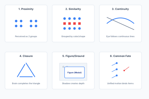
| Principle | Definition | Design Application |
|---|---|---|
| Proximity | Elements placed close together are perceived as belonging to the same group. | Group related form fields; keep a label adjacent to its input; cluster related navigation items. Separating unrelated items with whitespace signals they are distinct. |
| Similarity | Elements that look alike (colour, size, shape, texture) are perceived as related. | Use consistent styling for all primary-action buttons; a shared icon style for related functions; a distinct colour for destructive actions (delete, cancel). |
| Continuity (Good Continuation) | The eye follows smooth, continuous paths; elements arranged along a line or curve are perceived as connected. | Align elements to a grid; use a visual flow to guide the eye through a multi-step form; a progress indicator that follows a linear path. |
| Closure | People perceive incomplete shapes as complete, mentally filling in gaps. | A partial ring as a circular progress indicator; card borders implied by whitespace and shadow alone; simplified icon glyphs where the brain fills in missing contours. |
| Figure/Ground | Perception separates the visual field into a salient figure (the focus of attention) and a receding ground (the background). | Modal dialogues that dim the background behind them; card elevation with shadow creating depth; contrast between content and canvas. The figure must be clearly distinguishable from the ground — low-contrast text on a similar-colour background violates this principle. |
| Common Fate | Elements that move in the same direction or manner are perceived as a group. | Elements that animate or slide in together are perceived as related; parallax scrolling visually binds related content layers. |
The Exam Method: Three Steps for Every Principle
The examiners consistently reward a fixed three-step pattern. Never name a Gestalt principle without completing all three:
- Name the principle explicitly — “Proximity,” not “things are close together.”
- Locate where in the given figure or interface the principle operates — point to specific elements.
- Explain the effect on the user’s perception or behaviour — “the user perceives these as one group, reducing search time” or “the modal dialogue focuses attention on the alert by pushing the background visually behind it.”
Worked Example: Superstore Sales Dashboard (2022 Q5a)
- Proximity: country names are placed directly beside their corresponding sales figures, so the two are perceived as one data point rather than unrelated text and numbers.
- Similarity: all revenue figures share one colour/weight and all quantity figures share another, letting the eye separate the two data types across the whole dashboard without re-reading column headers.
- Continuity: the shared, aligned baseline of the bar chart lets the eye read relative bar heights along one continuous reference line, supporting quick visual comparison between countries.
Gestalt in Tripos History
Gestalt appears almost every year. The pattern is consistent: the exam presents a figure (a dashboard, a blog interface, a profile layout, a map) and asks you to identify which principles are being applied. Memorise all six with one crisp example each.
Expected Learning
- Name all six Gestalt principles with a definition and a concrete design example for each.
- Apply the three-step exam method (name → locate → explain effect) to any given interface figure.
- Critique a misapplied Gestalt principle — e.g. items placed far apart that should be grouped, or dissimilar items placed close together that misleadingly suggest a relationship.
- Explain why Gestalt matters for interaction design: perception precedes cognition, and layout errors that violate Gestalt principles mislead the user before they even start reasoning about the interface.
Past Paper Questions
Gestalt appears in: 2024 Q6 (applied to own design), 2022 Q5 (Superstore Sales Dashboard), 2020 Q6 (six principles), 2019 Q6 (four UI elements — blog, Twitter, maps), 2017 Q6 (six principles applied to a given figure). This is one of the most frequently examined topics on the paper.